Taking the 'Ooh' out of Google: Getting site search right - Part 12
Yesterday I began to wrap up my series of posts about getting site search right with the start of a step-by-step guide to transforming the style of Google results that users are familiar with, into something with a richer user experience.
Add structured data
Google understands a lot about the structure of the web. It understands how all the pages that it has crawled on your site are linked together, and uses this to understand what the key pages are. It also understands the complicated map of links that bind the hypertext of the Web together. However, understanding these links and structure is not the same as giving it semantic value.
By contrast, if your content is organised into a classification hierarchy of news, sport, business etc, these labels convey meaning to your users. So use them. On the search results page, let people see which area of the site a story has originated from.
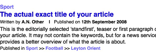
In most cases, this is much more meaningful to users than displaying the URL. Google needs to display a URL to show users which domain a page has originated from. On site search, however, it can be taken for granted that the story belongs to the site that one is searching across.
Add thumbnail images
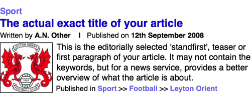
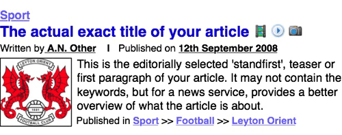
Google only uses thumbnail images on selected news items and for videos from YouTube, yet, when images appear, they provide an excellent visual clue to users as to the contents of a particular search result. Especially if the search terms contain some ambiguity, the inclusion of an image can allow a searcher to instantly recognise whether a result is on their topic or not.
Make everything that could be a link, into a link
Make your search pages really clickable by making everything that could be a link into a link.
The title of the article should, of course, link through to that article. However, there is no reason why clicking on the text snippet shouldn't lead the user to the article either. And, if you've included a thumbnail image, the chances are that some users will be inclined to click on the image, so make that a link to the article as well.
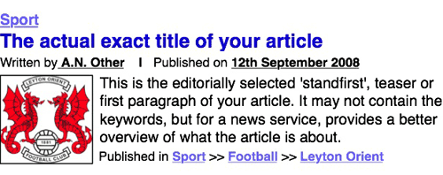
The metadata can be made into links as well. The author's name should link to their profile page if it exists, or at the very least a set of search results that only display articles written by them. The publication date should lead to a page containing a list of all the articles published on the date if you have one. The structured section data should lead to those sections of the site, facilitating lateral navigation.
Signify important information
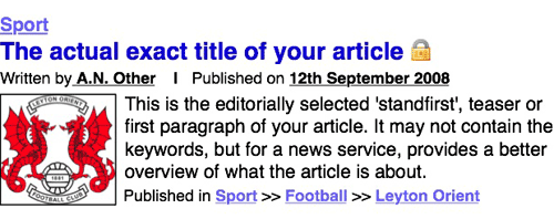
If you have a mixed business model that offers free access to some articles, and restricted access to others, then you should illustrate this in your search engine results. Whether the archive articles require a paid subscription, or just registration, an icon can be used to give the searcher that information straight away. This can help prevent nasty surprises for the user as they hit the paywall.
Make the most of multimedia
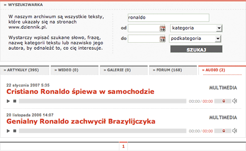
If your technology allows, then incorporate your multi-media results into your regular search. Google sometimes adds a few images at the top of the their regular search results, but audio, video and image search are usually only available from Google via links at the top of the page.
You can use icons to indicate where you are returning results that are video, audio or image galleries.
If possible, you can consider, like Dziennik Polska, playing multimedia directly from the search result pages.
Add extras
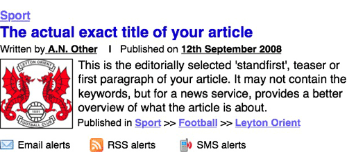
Google provides RSS feeds on some search products, and offers a separate alert service. Integrate these offerings with your search results page. Make sure it is easy for users to subscribe to RSS feeds, email alerts, or SMS updates letting them know when new articles are added to your site that match their search criteria. It is an aid to researchers, and a chance to build customer loyalty and earn repeat visits.
And finally...
That brings this series to a conclusion. You can now download all 12 parts as one printable PDF document. If you've enjoyed this, you might also be interested in some of my other currybetdotnet articles about search usage and interface design:
- Newspaper "Site Search Smackdown" - April 2008
- Smarter searching: liberating information from the Internet - October 2006
- Surveying search across British online newspapers - July 2006
- Looking at the new BBC search - May 2006
- A day in the life of BBCi Search - March 2003