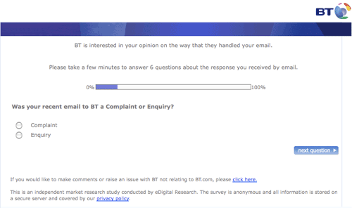
Hard to have 'no comment' about this BT email survey
I had so much hassle with Greek state telecoms monopoly OTE, that I figured that dealing with BT in the UK could only be a breath of fresh air. Ho! Ho! Ho!
Anyway, tomorrow morning I'll be waiting in for the engineer who will maybe finally give me a glimpse of broadband in the UK. But not before I had to deal with the BT customer contact satisfaction survey. Actually, the contact I've had with them so far has been just fine to be honest, it was the survey itself which irked me with some odd interaction design decisions.
Firstly, they emailed me a link to the survey, and when I clicked the link, it re-sized my browser.

Now, re-sizing the user's browser may have had a purpose during the browser wars in the late 1990s. People had smaller monitors, and inconsistent rendering between main rival Netscape and Internet Explorer browsers meant that people often coded fixed width tables and then fixed the width of the browser to fit that.
But hang on guys, it is 2008. Nobody needs their browser re-sized to make sure that your right-aligned progress button is appearing on-screen. In fact, maybe, if you are worried that the button won't be seen on screen, it is a hint that a centrally aligned button might be a better design? Plus, since I'm using Firefox, and have it set to spawn new tabs rather than new windows, the re-sizing affected everything else I was working on in the browser at the time. Thanks.
It is a simple mantra, but "leave the user in control" is a fundamental tenet of providing a good user experience.
The second thing that irked me with the survey was one of the very last questions:
"If you would like to leave us some comments about your email experience, please write them here"
'If you would like to leave' certainly sounds optional to me, so I simply clicked the button 'Next question'...
...only to be smacked in the eyes with lots of red letter error messages.

What I had failed to notice was that in order to leave no comments, I had to actually tick a check box that said 'No comments'. Even though the wording of the question implied that filling this form in was totally optional, I had to physically register with BT that I was leaving 'No comments' before I could make any progress.

As I'm sure you can imagine, they ended up with quite a few comments about their web form design...
The browser window resizing thing used to really annoy me until I had a closer look at the Firefox preferences dialog.
Preferences -> Content, then press the "Advanced" button next to "enable javascript". Untick the box allowing scripts to move or resize existing windows.
In fact I usually turn off all of those options.
Made my life far happier :-)
Thanks for that tip Dave.
Incidentally, I should add that the engineer came this morning, he was a lovely chap, and got the phone up and running in no time - so no problems with the actual telephony part of the service at all.