Taking the 'Ooh' out of Google: Getting site search right - Part 10
Over the last couple of weeks I've been publishing a series of posts about getting site search right, based on my presentation at the 2008 Amsterdam Euro IA Summit.
Today I wanted to look at some examples of poor search user experience design which you should seek to avoid.
Don't use confusing gimmicks
Lots of search technologies come with plenty of features in them for displaying relevancy to the user - almost all of them useless. Giving results a star rating or relevancy percentage doesn't convey anything meaningful to the user. They can easily determine relevancy for themselves. For a start, they expect the top result to be the most relevant, and they expect to be able to judge from the result if it is what they want.
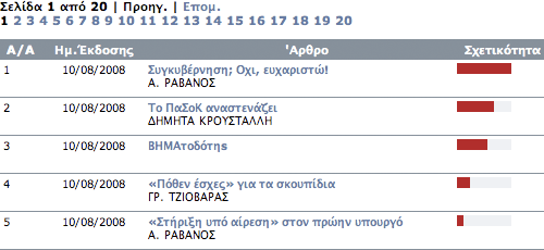
Το Βημα in Greece has a search results page with a lovely bar chart illustrating the relative relevancy of the listing, but virtually no 'real' information on which to judge whether a result is useful or not. The SERPs displays the title, author and publication date of an article, but no text snippet.

Dziennik Polska, meanwhile, has an unfathomable star rating applied to some results, but not to others.

I've got no idea at all why the 'two star' ranked article is higher in the listings that the 'four star' items - or why some of the results have no stars at all.
Make it work!
And one thing you need to do, whatever interface you decide to implement, is make sure that your search wrks. Not everybody does. Iltalehti in Finland, for example, offers a Google supplied search with three options - 'Iltalehti', 'Alma' and 'Web-haku'. All of them, at the time I was doing the research for this article, produced completely null results sets, whatever you searched for.

Giving up the ghost
Some newspapers, mind you, do seem to have completely given up on search. Take the English version of the Karjalan Sanomat, a Finnish language newspaper in the Russian Republic of Karelia. This weekly newspaper provides a date-ordered text link index of the year's content, with no clue as to what the stories contained are. It then delivers the content in a frameset, to make sure that Google, or any other search engine, can't help you locate anything either.

If you can't beat 'em...
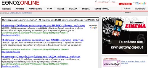
If you are going to hand over your search technology completely to Google, then there is a right way and a wrong way to go about it. Εθνος in Greece, uses Google's syndicated search. It places the results within an iFrame on an Εθνος branded page. This layout does not work particularly well, and looks cramped and awkward.

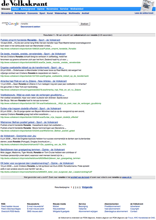
By contrast, De Volkskrant in the Netherlands has a very clean and fresh look and feel for their Google powered results.

Next...
Later this week I'll be beginning a step-by-step guide to transforming your search results from the standard Google interface into a distinctive site search service, using lessons from the examples I've been showing over this series.