Taking the 'Ooh' out of Google: Getting site search right - Part 4
I've been presenting a series of articles based on my talk at the 2008 Euro IA Summit in Amsterdam about 'getting site search right for news'.
Last week I looked at utilising information that Google can't obtain to make your UI distinctive, and adding thumbnail images into the search results page to improve relevancy recognition for users.
Today I want to look at a perpetually tricky area - advanced search. In recent years, even offering advanced search has sometimes been viewed as an admission of failure - since Google's model of the one-size-fits-all input box has dominated our concept of search.
However, in my user studies, I've observed increasingly that users will rely on Google to get their results in preference to using a site search. If asked, whilst visiting foo.com, to find out all the information on foo.com about 'bar', I've observed a lot of users happily typing 'bar foo.com' into a Google box as their query rather than resort to site search. That suggest to me that increasingly even using a site search is a form of advanced search selection in itself. Particularly when dealing with time sensitive archive material like news, I believe that 'advanced search' options are a vital part of a site search offering.
The Athens News approach
None of the above, however, stops people doing advanced search very badly. I have to say that whilst I lived in Greece, virtually everything I understood about the country's politics, history and current affairs I understood because of the Athens News. In Mark Dragoumis the paper has a fantastic columnist, who I will almost certainly continue to read online now that I've moved back to the UK.
Nevertheless, their online search facility is almost a text book example of how not to produce a search interface.
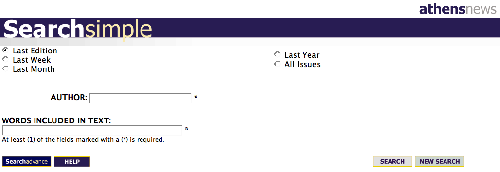
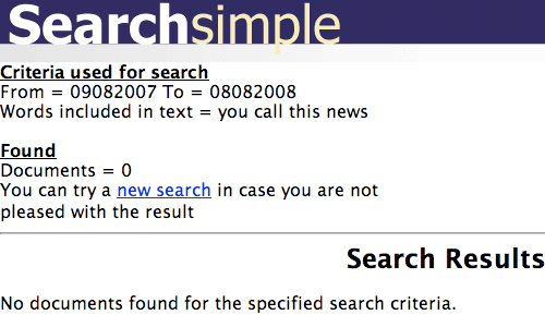
Despite having plenty of boxes for you to fill in, almost anything you type in produces a null results set
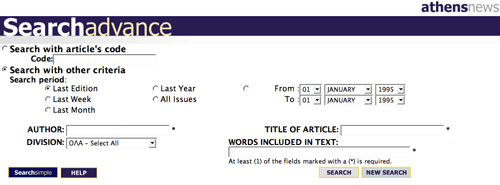
The 'Search Advance' interface introduces some even more confusing new elements. The date range selector is hard-coded to start and finish searches on the 1st January 1995, meaning the default value is virtually useless.
Other options include searching for an article by a specific 'code', which might be fine for an internal production tool, but I'm unsure how the general public are meant to know these codes. They do not appear in print, and only appear on an article online after you've already found it to read it.
If you are going to offer advanced search, it needs to offer advanced functionality without requiring specialist knowledge to fill in the form. As we shall see, some newspapers across Europe have some advanced search functionality that retains a degree of user-friendliness.
Making date entry straightforward
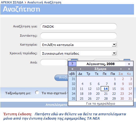
Advanced search interfaces need not be so difficult. Historically there has been a tendency to produce complicated forms with lots of drop-downs. Another newspaper in Greece, the popular Τα Νεα, takes a calendar approach to allowing users to slice their results by date. This is an interaction that many users will be familiar with through booking travel or holidays online.
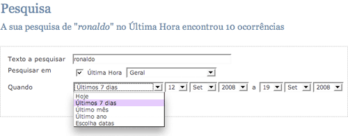
Público in Portugal has an advanced search entry form that combines the ability to select a specific date with the ability to select time ranges. When 'Últimos 7 dias' or 'Último mês' are selected, the explicit dates shown update to reflect the correct range based on the current date.
Avoid advanced search blind alleys
In the Netherlands, the Algemeen Dagblad has some nice touches in their search interface. They provide an advanced search form offset to the right-hand side of the regular results.
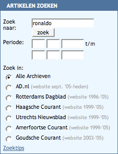
What is important here is that alongside the choice for the user of selecting to search different date ranges, there is also an indication of what is actually covered by the archive. I can see straight away that there is no point looking for articles published between 1984 and 1987, as these are not online.
In this specific case, it is also a neat way of side-stepping an organisational problem. The Algemeen Dagblad absorbed several regional titles in September 2005, hence the change in structure of the web archive.
Incidentally, on their search engine results, I'm impressed with the fact that they also indicate whether a story has generated comments or not. This is again something that Google can't currently do, and I like the fact that if there are no comments, then the 'Reacties' information simply disappears, saving space, rather than indicating 'Reacties: 0'.

Make advanced search into a narrative
Elsewhere, Spain's El País provides an advanced search entry form at the foot of each search results page. My Spanish has mostly been learnt from Dora The Explorer, but even I can see that with '¿Qué?', '¿Dónde?' and '¿Quándo?', El País have broken the advanced form into an easy set of questions for the user to answer.
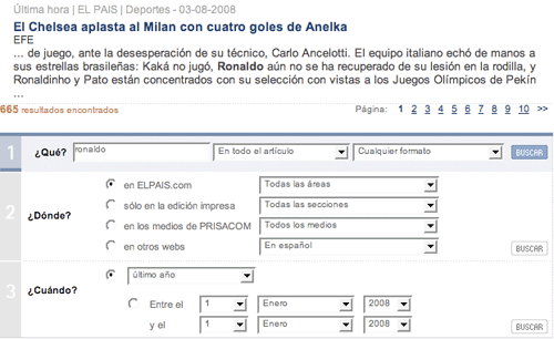
The search form isn't tucked away behind an 'Advanced search' text link either. El País includes the complex search from at the foot of each results set, inviting users to try out an advanced search without them specifically having to decide that their query is 'advanced'.
Next...
Tomorrow I'll be looking at some examples of distinctive search interfaces that make using site search a positive user experience.