Take-away facts and quotes from the 2008 Euro IA Summit in Amsterdam - Part 2
Yesterday I started blogging some of my take-away facts and quotes from this year's Euro IA Summit at the Tuschinski Theatre in Amsterdam. Here are some of the things that stood out for me on the Friday afternoon.

"How do you re-design a business critical web application with billions of unique products" by Floris Ketel
"KLM are in the room. If they have to correct me, I will get slapped"

Floris Ketel was presenting a case study on the development of a new updated version of KLM's online booking system, and distinguished himself by being the only person I saw to incorporate a video loop on the title slide of their PowerPoint presentation.
A couple of useful points came out of the talk. One was that this was yet another project where a company was attempting to re-position themselves in a way that did not seem to resonate with their customers. KLM want to move from selling flight tickets to being more of a full service travel agency destination, with partnerships selling hotels and car rentals. Users, though, found the idea of KLM having a 'shopping basket' alien - they were buying tickets, and didn't see what else they would be expecting to buy from the airline.
Another good lesson was that the airline built a prototype, and then did live A/B testing with real users. They also went and did user testing by turning up at Schiphol to grab people waiting for flights in the business lounge.
I was intrigued by their approach to navigation facets. All through the project the design had featured a faceted navigation panel, swapping between the left-hand and right-hand sides of the screen with various iterations. Floris stated that their studies showed that 50% of users noticed the facets, and that 20% of users employed them. Of those that did, 85% rated them as useful. However, the only design that didn't feature them was the final one - where the options were condensed into a drop-down. It looked to me, although I might be being unfair here, that there had been a failure of nerve with the design.
"Getting the right ticket before the train leaves: The challenges of user-centered design for the Swiss Federal Railways" by Andrea Rosenbusch
I was keenly anticipating this presentation by Andrea Rosenbusch from Zeix, as I rather hoped it was going to have lots of pictures of trains in it. On that score I was rather disappointed, and had instead to make do with a brief video clip of a Swiss tram at the end, and some pictures of touch screen ticket interfaces.
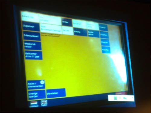
Their project seemed to have been a nightmare of trying to get to grips with the complex pricing and ticketing arrangements for cross-border train operation. I was surprised that they had got it completed so quickly, and was rather taken with a cardboard touch-screen ticket machine prototype.
They took the approach of delivering one back-end infrastructure, and then different user interfaces for the public and for sales-staff. This meant that the sales-staff had access to more options, and could use their own prior knowledge of route codes, timetables and restrictions. The system was a real boon for the sales force - previously for cross-border trains, in order to even find out a total price for a journey, they would have to actually issue the tickets.
Andrea's colleague Jacqueline Badran joined in the Q&A session with a fiery contribution, and I spoke to her afterwards, where she expressed an earthily phrased disdain for Mrs Thatcher and the privatisation of the British railway network.
"Change is inevitable: What Semantic Web and Web 3.0 mean for IA" by Claudia Urschbach
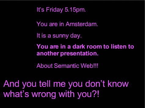
Claudia opened with a silent on-screen conversation that asked the audience why they were in a dark theatre on a sunny Friday afternoon in Amsterdam listening to her instead of being out having fun. She identified the cause - the IA-Persona is basically a weirdo!
"We struggle to adapt to agile development because it means we can't hide in a room for 4 weeks in order to produce a 120 page document with 15,000 annotations."
"We don't stick to the principle of unique identifier when it comes to our job title"
She gave a broad overview of the areas of development in web technology that were going to impact on the job of the IA in the future, as we 'make good and inspiring products for people who interact with a computer, a telephone or some sort of machine'.
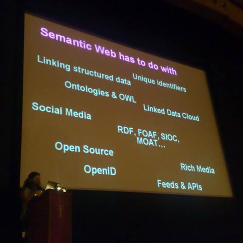
One of her key points was that an 'Internet without sitemaps' doesn't mean less work for IAs, in fact it probably means more. And perhaps a lot more of the Excel spreadsheets that Chiara loves, as we struggle to set the information space rules that will govern web services and applications.
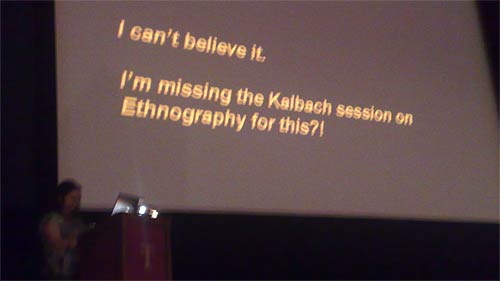
Claudia's slides are available on Slideshare, and the only downside to watching her talk was that it meant missing James Kalbach's presentation on "Commercial ethnography and innovating information experiences".
There was a nice exchange with Eric Reiss at the end. During her talk Claudia had mentioned that she had 'cringed' to submit a talk with "Semantic web / Web 3.0" in the title, but that it had done the trick and got her onto the stage. Eric pointed out that it was the buzz words in the title that had nearly kept her out, not what had got her in.
Jam Session
Instead of a formal poster session, the evening drinks featured an opportunity for anyone to 'show their working' in the Tuschinski Theatre foyer.
John Ferrara showed some of his wireframes for game and interactive comic development, and User Intelligence showed off a great way of visualising web analytics to make them intelligible to CEOs and marketers, which I'm frankly going to steal.
Olga Revilla presented "Mailing list digests in Infoxication Age", a study of how the mailing list digest format could be brutally optimised by discarding computer goobledegook and poor netiquette.
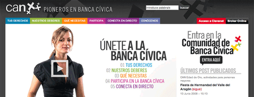
My favourite was some work presented to me by Luisa Santos Pacualena of Biko2. This was a website for a civic banking initiative by the Caja Navarra that allowed account holders to vote for and blog about social initiatives that they wanted the bank to contribute funding to.
The 'Jam' was run on the basis that anyone could pitch up, fill in a form, and then have a table to display on. My only reservation with it was that it was very easy for 200+ people to say to themselves that they would bring something to the 'Jam', and then not at the last minute, whereas having had a formal poster accepted meant that last year people were pretty much obliged to turn up with something to show.
Next...
Tomorrow I'll be blogging some of my thoughts about the second day of the conference, including exactly how intimidating the beautifully detailed but massive Tuschinski Theatre looks from the stage.

I most liked is the Jam Session. what a point you have said. "How do you re-design a business critical web application with billions of unique products" but not justified. I mean let clear that...../