ERT re-design takes a cue from the BBC
Just as I was leaving Greece, state broadcaster ΕΡΤ relaunched their news website. The design follows a new set of visual graphics on the three state-owned TV channels, and makes some significant improvements on the previous design.
The news site now much more closely resembles a blog, and, according to the metadata on the pages, it is being powered by Joomla. All stories are clearly date-stamped with permalinks.
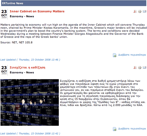
There is also a very prominent calendar for navigation via date, which is common on blogs, but altogether much rarer on a news site.
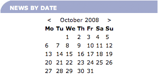
When I was looking at the site last Thursday, there still seemed to be some teething problems. Notably the English language version contained more than its fair share of Greek language stories, although this mostly seems rectified now.
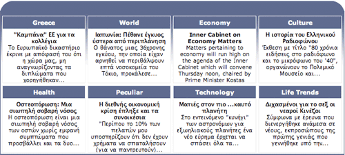
The ERT site formerly had news about Greece in 8 languages. The new version only featured Greek and English when I looked at it, but I guess that additional language support may be later on in the launch plan.
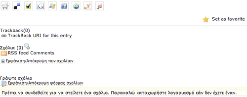
From a 'Web 2.0' point of view, the site features prominent promotion of RSS feeds in the banner area, and a plethora of social bookmarking buttons on each story including Delicious, Facebook, Google Bookmarks, Joomlavote, Joomladigger, My Yahoo!, Reddit, Stumbleupon and Windows Live Favourites.
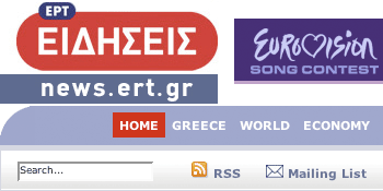
A slightly unusual feature is that along with icons to view a printer friendly version of the page, and to forward a story as an email to a friend, each item has a PDF icon, indicating that the user can download a PDF copy of the story.
The re-design is also another case of "here's one I made earlier" for the BBC rather like with HRT in Croatia and RTL in Hungary. In this case, ERT decided that what they needed for their homepage was an analogue clock, just like the Beeb's.
