The Mirror re-design review: Part 4
I've been reviewing the recent re-design of Mirror.co.uk. I've been impressed with some things, like the organised site map in the footer of the page, a forgiving tag 404 page, and the RSS feeds of tags. I've been less impressed with the gambling strip design, colour-coding and lax taxonomy. Yesterday I looked at some aspects of The Mirror's site search.

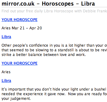
Mixed horoscope feeds
The Mirror has made nearly all of their online content available via RSS, including the full content of their horoscope prediction. The feed looks like it needs a bit of a fine tune however, as other star signs seem to be leaking into my feed for Libra.

Now, if I could only find an RSS feed for my hepatomancy predictions, I'd be sorted...
The curious incident of the rating in the night
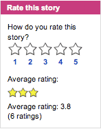
One of the items in the new Mirror design that I find most odd is the 'rating' feature. Every story has a box in the right-hand side asking the user to 'Rate this story'.

Rate it for what? Factual accuracy? Entertainment value? Pretty pictures? Spelling and grammar?
There doesn't seem to be anywhere on the site to expose the result of this rating - there are no 'most rated' or 'highest rated' lists that I could find, so it is hard to see what the purpose is. Which is just as well, as the system is easily gamed. I spent five minutes rating all the stories I could find that featured 'Leeds United' as 5-star, and all the stories that featured 'Chelsea' as 1-star, because I could. What are those rating supposed to convey to anyone who comes along later to read those stories? And does that indicate that I was more 'engaged' with the site?
I'd suggest that the Mirror's management need a quick crash course in why to have a rating feature on a website, by reading Alex Kirtland and Aaron Schiff's "On a scale of 1 to 5" article.
Social bookmarking links
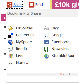
To accommodate social bookmarking links, The Mirror uses a red share icon at the top right-hand corner of each story. This is a widget supplied by AddThis.com, and it initially unfolds to provide the user with a choice of 9 different social bookmarking services to use. These are Del.icio.us, MySpace, Reddit, Windows Live Bookmarks, Digg, Google Bookmarks, Facebook, Newsvine and StumbleUpon.

A '>> More' link opens up an AddThis.com pop-up which expands the selection to cover 34 different bookmarking or link sharing services.
Incidentally, later this month I'll be covering the relationship between newspapers and social bookmarking sites in more depth.
Conclusions
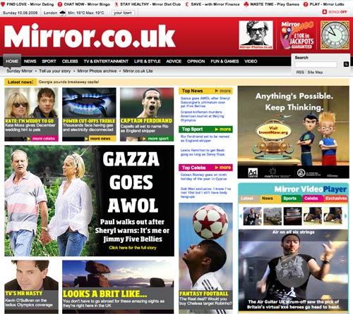
The Mirror has gone for a bold and distinctive visual magazine-style design, which is heading in a different direction from the majority of British newspaper sites. Recent broadsheet and middle-market paper re-designs they have tended to go for a light look using a lot of whitespace. In contrast, The Mirror has gone for a high-colour picture intensive homepage.
There are some solid principles under-pinning the design, and I am impressed with the newspaper's implementation of tagging and RSS feeds, which go back some way into the archive. Although the paper may need to get a tighter control of the quirky vocabulary used in some of the tags, this is a good way of building related and lateral links across the site.
However, I must say that there are a lot of aspects of the design and functionality that I am not too keen on. I find the rating feature to be a less-than-useless gimmick, the colour-coding intrusive and the strip of gambling links at the top of every page make the site look tacky to me.
I don't see this as re-design that would bring me back to browse the site more frequently.