A painless way to file your tax return
Very often when I'm writing about some online application or web site or the other, I'm making a list of things that could be improved. It is always much nicer to be able to write something completely in praise of a system - in this case the HMRC's online tax self-assessment application.
Well, I can't completely praise the system, since it is designed to part me with my hard-earned money. And you know they are only going to waste it on mediocre schools, the monarchy, campaigns aimed at teenagers using media that teenagers don't read or watch, and sponsoring Newcastle United's shirts...but I digress.
Her Majesty's Revenue and Customs officials are trying to push more and more people down the route of filing their UK taxes online, and I've noticed a vast improvement in the application between the 2006/7 tax year and the 2007/8 one. Not only is the form simplified in many areas, but the whole application runs more smoothly, and that is because they've got 10 key features right.
1. The application automatically saves your progress
Although the tax form seems simpler than I remember the previous year's being, it can still be a lengthy beast, and you might need to take several attempts to get every section filled in correctly. The HRMC online submission keeps your submission saved all the way along, every time you move onto a new page. I even suffered a browser crash, and re-entered the system to find no data had been lost.

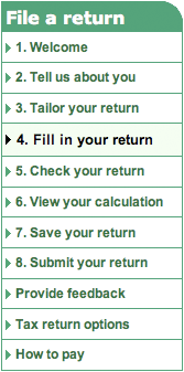
2. You can move backwards and forwards through the form
Pretty much all the way up until you press the final 'send' button, you can move backwards and forwards through the form, adjusting values as you need to. It means that you can run through the form and get an idea of your likely tax liability, even if you don't have the exact figures to hand for each section at the first pass.
The only point where your navigation is constrained is when you first start to file a return for the tax year. At this point the application requires you to go through around four screenfuls of questions in order. This is to 'tailor' your tax return so that it only has the necessary sections. After that, you can move around at will.
3. Error messages are intelligent and jargon-free
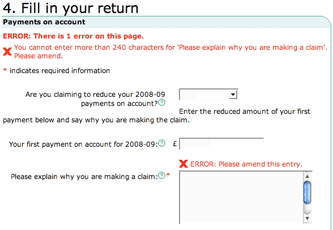
If you enter values that are not permitted, the application clearly sign-posts this. There is an error message at the top of the page that informs you there is a problem, and an indicator next to the field that requires changing.
Explanations are free of jargon, and give clear instructions like "The value for x cannot be 0.00. It must be greater than zero or left blank"
4. Contextual help everywhere
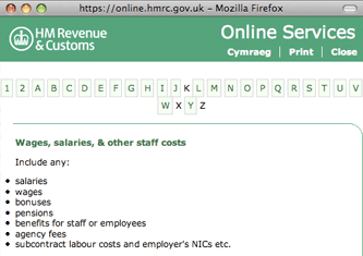
Every single question or input box on the whole of the form has a contextual help question mark icon next to it.

These open up pop-ups with targeted information about that precise bit of data. It is a really unintrusive way of providing assistance for all users at every stage of the form-filling transaction.
5. It supports 'advanced' users and 'novice' users
Some of the elements on the tax return, like calculating 'Capital Allowances', can be quite complicated. A 'Capital Allowance' spreads the tax relief on major business purchases across several tax years, and so the amount you claim depends on what you've spent this year, and what you claimed last year.
Of course, if you know what you are doing, or your accounts have been prepared fully offline, you'll know the correct figure straight away.
The HMRC self-assessment application facilitates both those who know what they are doing, and those that don't. If you can't calculate for yourself the final sum to be claimed, you can go through a 'worksheet', which is essentially an online wizard to guide you simply through the calculations.
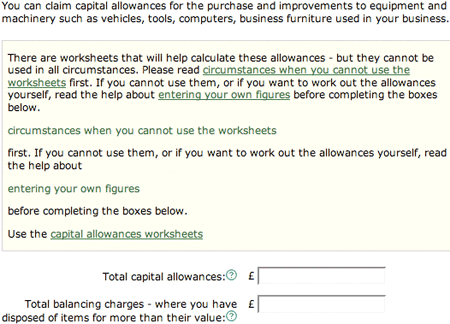
What this means is that the application supports both 'advanced users' and tax novices with the same page. It doesn't force an advanced user down the step-by-step wizard route, but neither does it force the inexperienced user to scurry off to work what numbers they should be entering here.
6. Progress is well sign-posted
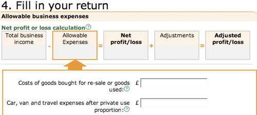
It is very easy to keep track of where you are in the form, and progress is clearly sign-posted. As well as an overall progress meter at the top of the page, some individual sections have headings that clearly indicate where you are in the process, and how the figures you are entering are combined to make up your final tax liability.
7. Security has several levels
e-Government systems that involve finances need to have ultra-tight security. To initially register with the system you have an ID number, and then you must confirm your account by using a verification PIN that is sent to you through the mail.
You can choose your own password, but the system ensures that you pick a strong one involving a mix of upper and lower case letters, as well as some numeric characters. You also need your Unique Taxpayer Number, and, in order to make online payments, you have to register a separate account.
That means you only have to pass your banking details to the HMRC if you intend to pay online, not simply as a a matter of course when registering. And with their record of keeping people's personal details safe, it is nice to know that at least the web side of the service seems to have followed some best practice guidelines.
8. The application is cross-platform
There is no "Sorry, this application can only be used if you've downloaded the latest version of Microsoft Internet Explorer and installed many, many ActiveX components". Nor is there a reliance on downloading any kind of offline application, although third-party software can be used in conjunction with submitting your tax form.
I was able to navigate the whole system very easily using Firefox on a Mac, and encountered no layout or functionality problems.
9. Saved output is HTML
In the previous tax year, if you wanted to print a copy of your tax return, the HMRC site would generate a Microsoft Word document. Of course, that means having some sort of Word document format-reading software to access it. This year, when you generate a print copy, the system makes a page of simple HTML. Again, it is a great way of ensuring cross-platform operability - if your browser can display the HMRC site, then it can display and save the output.
10. The application is lightweight
There are no unnecessary bells and whistles on the tax submission form. It must have been tempting for them at the design stage to go for a very flashy AJAX-heavy solution, with lots of on-the-fly updating of your tax status.
Instead, they seem to have opted for the very lightest and simplest implementation possible - which is great. I whizzed along using the form even though I only had access to a 32kbps dial-up Internet connection, which isn't fast enough to cope with a lot of modern Ajax-driven sites.
Scalability for the tax system
Nobody enjoys filling in their tax return, but at least with the new online self-assessment form it is relatively painless and efficient.
Sadly for the team behind the application, they are unlikely to get much praise for having an e-Government system that works. Instead, I bet the only time you'll hear about it is on February 1st, when it almost inevitably melts on the deadline day as everyone and their mother tries to file their taxes at the last possible minute...
"The value for x cannot be 0.00. It must be greater than zero or left blank" ?
That *particular* example is The Fail - there's no excuse for bouncing the user through that page a second time simply because the site authors were too thick to work out that FALSE and 0 are, in this case, the same thing.
But given everything else, I suppose they earned a pass.
Yes, maybe that wasn't such a good example. What I meant was that it was very clear about what the error was (even if it should have been parsed better), rather than just spitting out "Duh! You gone done something wrong"
Good to know it works so well, I shall look forward to using it now that I've finally won my four-year battle to get the Inland Revenue to change my address - sending the PIN through the mail isn't quite such effective security in this instance ;-D
Last year on checking my self assessment final page, I realised a mistake and went back to alter the relevant page.
I sent the correct self assessment completed several days later. I received the official acknowledgment
However, the HMRC said I owed more tax than the final assessment, I found they were working on the incorrect final page. They subsequently admitted they had received the correct SA and admitted the error.
So does the HMRC receive copies as you are working out your assessment? This year, I will work it all out on paper first!
Our accountants managed to file online last year even though the system fell over. The software they use files electronically but doesn't use the public facing website.
Great article but it's much easier to let your accountant do it!