The Daily Mail site redesign: Part 2 - Message boards
Yesterday I started looking at the Daily Mail's recently redesigned website, concentrating on some of the navigation aspects, and looking at the provision of RSS feeds. Today I wanted to look at an area that they themselves are calling 'new' and 'improved' - their message boards.

Message boards
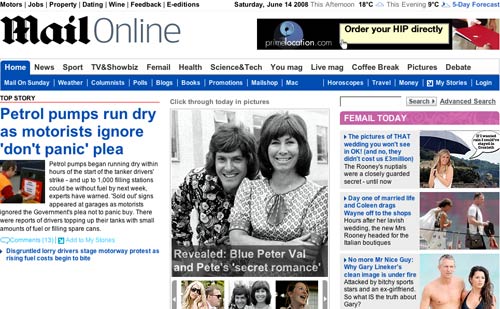
Whilst some national newspapers have been indulging in tit-for-tat spats over what gets moderated in their user-generated content areas, the Daily Mail has set about re-vamping theirs. Comments underneath article still work in pretty much the same way as the previous site design. The most recent 3 are displayed, and the user has the option to 'View all' if there have been more than 3 comments left. It is the message board and forum area that has undergone the most work, and it is now promoted by a 'Have your say' panel on the homepage.

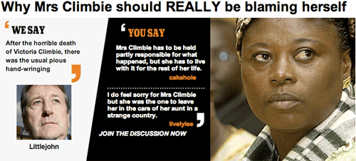
There is a very graphical new front page for the message board area which I like, with picture promos for threads that pit a quote from the Daily Mail's editorial comment against a couple of responses from readers.

The boards are, as you'd expect, broken into several topic areas.

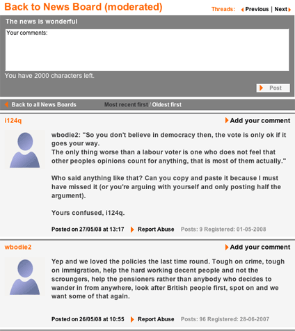
One interesting thing here is that individual threads are displayed with the most recent post first. This results in an experience similar to top-posting in emails, a practice that has been the bane of Internet geeks since the non-geeks first got hold of the network. It means that if you arrive at a thread for the first time, initially you start reading it backwards.

This is a very brave design decision in my view, as few message boards follow this pattern. It works well if you are a regular contributor who has been frequently keeping up to date with what is happening on a thread. However, it is a very jarring experience the first time.
The Daily Mail do provide an option to sort the posts into chronological order with a link at the top of the thread. This is very useful, but doesn't stay persistent. If you click it on one thread, then move to view a second thread, posts revert to being 'most recent first'. I'd like to see that choice made more sticky with the use of the light touch personalisation of a cookie.

I did like the very clear set of house rules for participating in the Daily Mail's community areas. There is an explicit explanation of how they apply sanctions to disruptive members of their online forums.
"Finally, we strongly support all members of the dailymail.co.uk and mailonsunday.co.uk community in enforcing and maintain high standards of participation. Should you feel that members are violating these standards, please click on the 'Report Abuse' link beneath the post in question to let us know."

A last point on the topic of the Mail's interactive section - if I was them I'd cough up the licence fee to iStockphoto so I could remove the watermark on the banner image on the Polls page!

Tomorrow...
In the next part of this series, I'll be investigating the way that the Mail has redesigned their individual story pages, and looking at the very heavy download footprint of the new site.
I'd expect to see discussion boards on "It's Political Correctness gone mad", "This country is going to the dogs" and "I blame the immigrants and asylum seekers". I presume they're there?
They may not say it as much as we think - a Google site search on dailymail.co.uk for the exact phrase "political correctness gone mad" only yields 94 results...
I had a look at the News Board (moderated) of the Daily Mail message boards and strongly suspect that it is a natural home for BNP/NF types - very unpleasant.
I am appalled that the daily mail, one of the most prestigous newspapers ever would publish such utter rubbish about the Strictly Come Dancing. Tom did not deserve to win, it was blatantly obvious but still the daily mail suported him. And also, why do you always seem to favour the labour party. They don't know a thing about running the country. I am 13 years old and I know more about running the country than Gordon Brown. All vote Monster Raving Loony Party or Standing At The Back Dressed Stupidly Looking Stupid Party. And finally, lower the price of the mail. Or I might be tempted to buy the Times instead. I am appalled!