The Daily Mail site redesign: Part 5 - Sports section
Over the last week I've been reviewing the Daily Mail's recently revamped website. There have been some highs, like the innovative use of celebrity RSS feeds, and lows, like the heavy download footprint and annoying content preview overlays.

Today I wanted to finish by looking at a section of the site which has been transformed for the better, and in the process demonstrates that the Daily Mail is really beginning to understand ways to utilise the power of the web to enhance their brand - the sports section.
Snack content
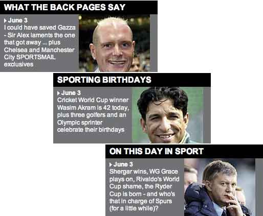
On the revamped sports section homepage I particularly like the provision of some easy 'snacking' content. A strip halfway down the homepage promotes a daily diet of anniversaries, a newspaper round-up, and a birthday list.

It isn't content that has a high editorial overhead to produce, but it adds a bit of changing zeitgeist depth to the sports homepage.
Visual football navigation
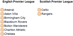
One of the great touches on the Daily Mail's sports section is the graphical navigation to pages dedicated to each of the clubs in the Premiership (plus Scottish giants the Queen's Celtic and the Pope's O'Rangers).

This is an excellent navigational device. It provides easy to use links through to tailored content, using icons that are recognisable to fans. It takes up much less space than providing text links would do, and it avoids any user interface complexity like a drop-down menu selection mechanism.
The fact that the badges are listed in alphabetical order, which will stay consistent during the season, provides the opportunity for users to develop 'well worn path' navigation. They can consistently hit the Mail homepage -> Sport link in menu -> club badge to get to their team's latest news simply and efficiently.
Well, provided they are in the Premiership of course - thanks to another play-off final defeat, it will be a long while yet before my Leeds United appear in this navigation strip!
News from around the web
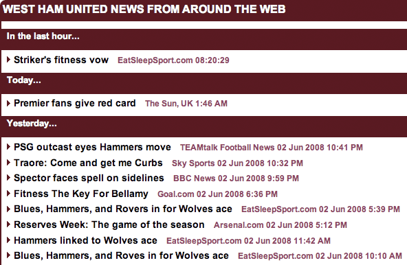
It is on these 'club pages' that perhaps the most significant editorial development in the Daily Mail's redesign can be seen. The top of the page is devoted to two or three recent stories about the club from the Mail's team of sports writers. However, the majority of the page real estate is given over to links to content about that team from other web sources including the BBC, Sky and rival newspapers.

This is a fascinating change of approach from that taken by most news websites, which is to focus solely on their own content, and avoid at all costs people clicking away from their site.
I've no doubt there was a great deal of debate at the Mail's HQ about whether this feature would simply drive users away from the site, or whether it would benefit the brand.
For me it shows a great deal of confidence on the part of the Mail. They clearly feel that they can make a page which serves as a great hub or starting point for exploring the latest news about a specific club, which I applaud. The Mail are promoting the feature wherever possible on the site.

One - and I can't resist the pun - own goal though. The Daily Mail offers RSS feeds on a club-by-club basis for the teams in the Premiership. However, the club pages don't seem to link to or promote these feeds at all, which seems a missed opportunity.

And finally...
I think there are still some challenges in the design, like the interaction on the message boards and the way that the width of story content still 'feels' constricted by advertising. And I'm definitely no fan of the heavy weight of the pages, which makes accessing the site on my 32k dial-up in Greece a chore.
There are some great new features though, which really show the Daily Mail has got a grip on using the web to their advantage. I'm particularly impressed with the RSS feeds tuned to specific celebrities, and the willingness to link externally and act as a content hub as well as a content provider about football.
On the whole, I think the Mail's redesign generally marks a big improvement on their previous iteration, which, to be honest, seemed to be doing the job pretty well. Now we just have to wait to see whether they can keep up their recent ABCe figure surge...
Those badges will be an excellent navigational device copied from the torygraph then...
Well, imitation is the etc etc...
Actually, the Mail have improved on the Telegraph model. The Telegraph journey is homepage > sport index > football index > club badge whereas the Mail have put the footie badges on the sport homepage, eliminating one of the steps.