The Daily Mail site redesign: Part 1 - Navigation & RSS
Way back when I first started the currybetdotnet blog, the Daily Mail was one of the first newspapers to get its own category, as I alternated between writing about BBCi Search and having a go at the Mail's coverage of things like London's telephone numbering system. These days, I try very hard to keep my honest appraisal of the Daily Mail's site functionality apart from my occasional irritation with the editorial coverage in the paper of things like games and Emo.
A few weeks back the Daily Mail fully launched their new look website. I've held off reviewing it firstly because I had all those Euro 2008 posts to get through, but secondly because from experience I know it can take a major re-launch like that a little while to settle down, and I wanted to give them a chance to shake off any teething troubles.

The platform has seemed pretty stable to me as a consumer, no doubt aided by the fact that they were test-running it as a 'beta' for some time. I wrote then about some of the features that I liked in the 'beta', and I was genuinely very impressed that they chose to do the re-launch in that way.
It seems that most of the features that I liked in the 'beta' have survived, although there is much more content in the finished product, and so some of them do not seem as prominent as they were. Over the course of this week I wanted to run through some of the things I like, and some of the things I don't, about the new site.
Navigation
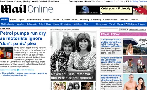
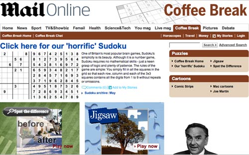
Overall I think the look and feel of the new site is a decent refresh. I was a little concerned at how the full navigation would work out, as only a small sub-set was available in the 'beta' test. With the main navigation the paper has very much played to the Mail's strengths. Rather than an overall taxonomy of topics or newspaper sections, they've gone for a mixed model which focusses on the main content areas - news, sport and showbiz - as well as branded sections from the paper like 'Coffee break'.

I like the concept of the 'Coffee break' area, as it gathers together a range of little interactive features to pass the time, in much the same way that the quiz and cartoons pages in the newspaper performs the same function. There are a range of online games that can be played, for example, which is a section done in collaboration with Zylom.com. [1]
There are a couple of bits of inconsistency in the navigation which irk me, but maybe I'm just being a taxonomy purist. If you click 'Pictures' on the top-level navigation, for example, you actually open up a page with 'News' as the highlighted section and find 'Pictures' is a sub-section of 'News' as well as a top-level heading.

Likewise, when on the 'Debate' pages, if you click 'Horoscopes' in the sub-menu, you find yourself transported into the 'Coffee Break' area of the site.

Well, not really. Horoscopes, Travel and Money links always appear in the far right of the sub-menu, but when there are a lot of items to display, it all runs into one list making the subjects seem related when they are not.
Innovative choice of RSS feeds

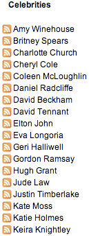
The Mail has taken an innovative approach to providing their RSS feeds. As well as RSS covering newspaper section areas like news and sport, they have a whole set of RSS feeds dedicated to specific celebrities.

To my knowledge they are the first UK national paper to do so. It shows a real understanding of the strengths of the RSS format, and I hope that these are a success for them.
Maybe it will encourage more newspapers to do people and location based RSS feeds in the future, which deliver niche content to dedicated fans who are hungry to consume stories from very specific news niches.
Tomorrow...
I'll be continuing to look at the Mail's major revamp of their site - looking at their improved message boards.
[1] I didn't check them all, but I assume these are not the types of games where you get 'kicked in the face and then shot - dead' that so appall Anne Diamond and the Mail earlier this year. [Return to article]