'Sorry - this page cannot be found': How newspapers handle 404 errors - Part 2
A comment when I started my recent 'Newspaper Site Search Smackdown' series of posts prompted me to go and have a look at which British newspapers use sitemap.xml files. As it turned out, it was only the Daily Mail and The Scotsman which I noticed, although The Telegraph and The Mirror and Metro have them as well. It meant that I got to have a close look at the 404 error pages generated by the others. I thought it might be worth running through them to see the strengths and weaknesses of each. Yesterday I started with a look at the 404 errors pages on the Daily Express, Daily Mail, Daily Mirror, Daily Star, Financial Times and Guardian websites.
The Independent
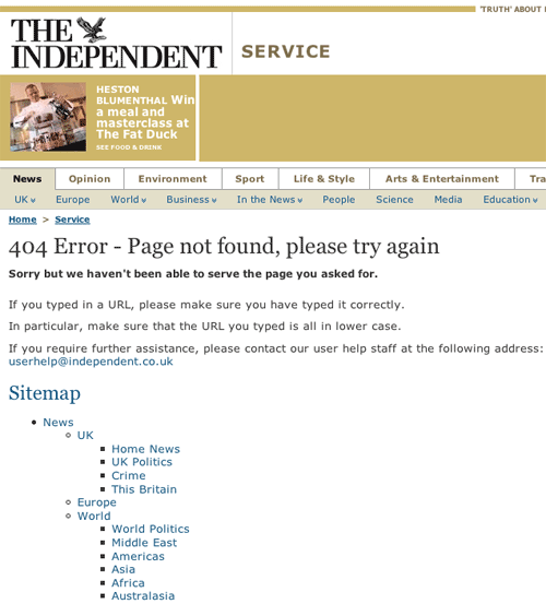
I got a funny sense of deja vu reading The Independent's 404 page text:
" Sorry but we haven't been able to serve the page you asked for.
If you typed in a URL, please make sure you have typed it correctly.
In particular, make sure that the URL you typed is all in lower case.
If you require further assistance, please contact our user help staff at the following address: userhelp@independent.co.uk "
The similarity with the text from The Guardian is uncanny
" Sorry. We haven't been able to serve the page you asked for.
If you typed in a URL, please make sure you have typed it correctly. In particular, make sure that the URL you typed is all in lower case.
If you require further assistance, please contact our user help staff at the following address userhelp@guardian.co.uk "
I'm not quite sure who gets to claim the prior art on the text here, but overall I think the The Independent has the more useful page of two. As well as including a comprehensive sitemap, their 404 page also feature's the site's regular horizontal navigation, and a search box. My only criticism would be that perhaps the site map is a little too comprehensive, which makes the page very long with a lot of scrolling to see all of the links.
The Scotsman
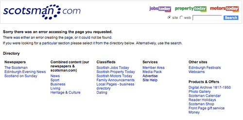
The 404 page from The Scotsman has a very clean light look, which discards the regular online branding of the site. The message to the user promotes the use of a small directory on the 404 page, or encourages them to use search.
" Sorry there was an error accessing the page you requested.
There was either an error creating the page, or it could not be found.
If you were looking for a particular section please select it from the directory below. Alternatively, use the search. "
The Sun
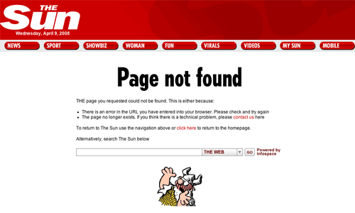
I thought The Sun had one of the best 404 pages offered by the newspapers that I looked at. The explanation of the possible errors was very clear, and the paper offers the reader plenty of options of what to do next, since the page has The Sun's standard masthead navigation, and a specially placed search box
"THE page you requested could not be found. This is either because:
* There is an error in the URL you have entered into your browser. Please check and try again
* The page no longer exists. If you think there is a technical problem, please contact us here
To return to The Sun use the navigation above or click here to return to the homepage.
Alternatively, search The Sun below "
I do find it odd though that the search box defaults to searching 'The Web' rather than searching 'The Sun' itself. I know that the default setting across The Sun's site is to websearch, but since the user has reached a 404 page on thesun.co.uk, it should be obvious that their search will be for content on thesun.co.uk. Additionally the call to action - 'Alternatively, search The Sun below' - makes no mention that the user has to use the drop-down menu to narrow the scope of the search box down to content from The Sun only.
On the plus side, the page also features a cartoon of Hagar throwing his hands up in horror and despair. I like touches like this which add a bit of character to the site, and make the experience of getting a 404 a bit less dull and technical.
The Telegraph
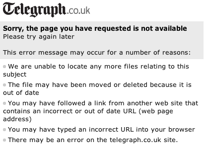
The Telegraph 404 page is short and perfunctory.
" Sorry, the page you have requested is not available
Please try again later
This error message may occur for a number of reasons:
We are unable to locate any more files relating to this subject
The file may have been moved or deleted because it is out of date
You may have followed a link from another web site that contains an incorrect or out of date URL (web page address)
You may have typed an incorrect URL into your browser
There may be an error on the telegraph.co.uk site."
The only navigational option for the user it to click The Telegraph logo to go to the site's homepage. There is no option to search or contact the paper, nor links to any of the major sections of the site.
The Times
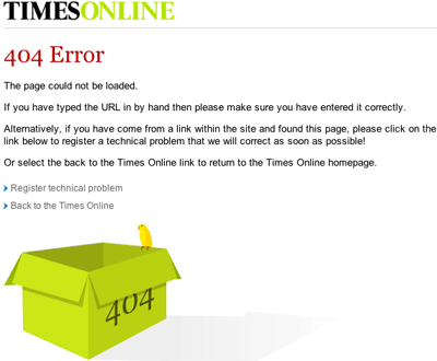
The Times has a very clear explanation for users of what might have happened for them to reach the 404 error page, and navigational options to go to the homepage, or report the error to the site's technical support. There isn't an opportunity to directly search the site however.
" The page could not be loaded.
If you have typed the URL in by hand then please make sure you have entered it correctly.
Alternatively, if you have come from a link within the site and found this page, please click on the link below to register a technical problem that we will correct as soon as possible!
Or select the back to the Times Online link to return to the Times Online homepage. "
Like The Sun's Hagar cartoon, The Times also includes a friendly graphic on their 404 page, although I have to confess that I somewhat mystified as to the significance of a bird perching on an empty box marked 404...
Conclusions
Some of the features that make a 404 page usable, and whether newspapers have them or not, are charted on the table below:
| Newspapers | |||||||||||
|---|---|---|---|---|---|---|---|---|---|---|---|
| Feature | |||||||||||
| Apology | |||||||||||
| Standard navigation | |||||||||||
| Site map or directory | |||||||||||
| Search box | |||||||||||
| Contact link | |||||||||||
| Retains URL | |||||||||||
Your final table uses red & green circles to convey opposite meanings; yet red-green colour-blindness is the most common type. Though you do use good "alt" attributes, using, say, green ticks and red crosses would make the meaning visually apparent; and preserve it for people with monochrome printers.
You make a couple of very good points there Andy - both of which I should have thought of myself. I've changed the yes/no/sometimes icons site-wide to ones that convey a bit more meaning visually without the need to perceive or print the colour.