Looking at the 'new and improved' Telegraph news section
Last week The Telegraph launched the latest part of the re-vamp of their site. Ian Douglas posted a blog entry about it, making the point that it wasn't just about the design, but about changes at the back-end as well:
"It’s much more efficient and easy to use, and the news team has been very pleased to get rid of the old system that was fiddly and demanded too much messing around with XML tags."

Like The Guardian and the Daily Mail beta, The Telegraph has gone for a staggered launch of the new system across different sections, rather than opting for the one 'big bang' re-launch. I'm impressed with the increasing maturity these newspapers are applying to their online product development.
I thought, though, I'd start with a couple of things that I wasn't so keen on about the new look Telegraph news section.
Mixed navigation model
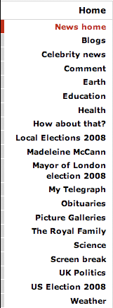
Within the 'News' section, The Telegraph is employing a mixed navigation model. This means having direct links in the left-hand column to navigational sections like 'Health' and 'Education', as well as more topical links to story themes like 'Madeleine McCann' and 'Mayor of London election 2008'.

I'm not a big fan of this approach. I'm all for having contextual and topical links - indeed I've even developed some in the past for the BBC - but when placed within navigation it seems to imply a mixed set of priorities. The Telegraph's implementation seems to list the mix of sections and news topics in alphabetical order.
Many users think a navigational list implies hierarchy. A casual glance at the menu therefore seems to imply that Madeleine McCann is a higher priority than the London Mayor, and that both are more important than the US Election, which is tucked below Obituaries. And all of them are insignificant compared to the 'Blogs' and 'Celebrity News' that visually dominates them all.
Duplicate 'Most viewed' stories
I've spotted a couple of occasions when the 'Most viewed' panel has featured duplicate stories. On Sunday, for example, "Wall of silence hid Josef Fritzl's crimes".

The story appears to be live on the site with two distinct URLs, which are being counted separately:
- .../austria/1924847/Wall-of-silence-hid-Josef-Fritzl's-crimes.html
- .../austria/1924847/Austria-Wall-of-silence-hid-Josef-Fritzl's-sex-crimes.html
The 'most viewed' list probably needs some way of recognising stories by both headline as well as URL.
Having pointed those out, there are a few things about the re-designed area of the site that I like a lot.
Lots of visual stories above the fold
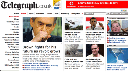
The grid design that the paper has adopted for the news section homepage really showcases content. They've minimised the space allocated to advertisers, and so can display 7 stories or video clips with an accompanying teaser image.

User testing has shown again and again that the eye is drawn to images on a webpage, and The Telegraph here has found a great way to give a visual overview of what is in the news that day, and get a lot of content into a small space.
Explaining the benefits of RSS
The failure of RSS reading to become a mainstream activity remains baffling to people who rely on it as their primary source of information from the web. Much of the problem is that the terms are so technical and uninviting, and that it is very hard to explain the benefits simply.
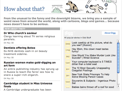
The Telegraph are having a good go here though. On their 'How about that?' section they promote the RSS feed as a way to 'Keep yourself entertained'.

Integrating a Digg widget
As well as having a very positive promotion for RSS, the 'How about that?' page incorporates a Digg widget, showcasing the best 'odd' stories from the social news site.

It is a great way of making the page more 'sticky' for users, by including some very clickable headlines alongside The Telegraph's own content.
URL re-directs from the old site
On the day that the new look was launched, I was reading the davblog account of a bizarre experience at a pub quiz that turned out to be the back-drop to a Derren Brown stunt. Dave included a link to a Telegraph story covering it, and when I tried to follow it I simply got re-directed to their news frontpage.
My initial reaction was that when the paper had pressed the big 'publish' button on the new CMS, they had over-written their old URL structure, and broken all their inbound links. I get really annoyed when sites do that, and effectively 'break the currency of internet' - links.
I've got around 80 items in del.icio.us tagged 'telegraph', and lots of links to telegraph.co.uk scattered around currybetdotnet, all of which would have been rendered useless at a stroke.
However, it actually appears that the Derren Brown story link not working is some kind of isolated edge case. Elsewhere all of the old main.jhtml?xml=/news/2008/01/26/nice126.xml URLs I've checked are re-directing effortlessly to re-published versions of the story with nice new keyword rich URLs.
I say effortlessly, but there will have been some considerable effort behind the scenes in order to make that happen. I have to congratulate The Telegraph here again for being forward thinking enough to have planned and implemented that.
Job well done
Overall it looks to have delivered a real improvement to the front-end, even if via Twitter I understand the CMS played up a bit over the Bank Holiday. Reaction on The Telegraph's blogs has been muted, but that isn't always a bad thing. When The Guardian recently re-launched their Sport section, Sean Ingle's blog post about it was swamped by comments, along with some entertaining, if ultimately futile, feature requests.
"thats all well and good sean, but when can we have a button that displays holly willoughby's funbags when you press it?"
I don't know what happened to that Derren Brown URL, but I'm pretty sure that it has nothing to do with these site changes. It seems that they just removed the story for some reason. They replaced it with a similar (but subtly different) version.
Perhaps it was just the amazing power of his mind at work...
Derren Brown: we missed that one. It's now redirecting properly.