IA for tiny stuff: Exploring widgets and gadgets - Part 2
Let us imagine a company, that has just been told by their whizzy new internet consultant that they need to develop their widget strategy if they are to stay relevant to their target audience. The company - Nom Nom - makes small fluffy toys of baby animals, aimed at the pocket money of their target market, 9 to 15 year old girls.

They've been told that the majority of this audience now has an online presence, and that a widget is an ideal way to get their product in front of these young eyeballs. Although the fluffy toys themselves don't make a compelling piece of online content, cute pictures of the baby animals they represent do.
Now, you may think it is a pretty cynical product proposition, but hey, it is never too young to start inducting our children into a lifetime of shallow consumerism on the web.
The company then has a meeting at which the various departments put forward their contribution to the Nom Nom widget strategy.
First up is the marketing department. They have a couple of concerns that they want the widget to address. They want to see it very clearly branded 'Nom Nom', since part of the exercise is to get the audience to identify with their brand and their product. Most of all, though, they want there to be an easy way for the girls to share the widget.
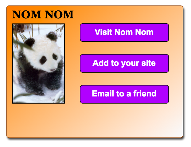
The key metric for most widget marketers is how many times the widget has been 'placed' or 'downloaded' or 'shared' or 'grabbed'. That means placing very prominent links to functionality like 'Email this to a friend' and 'Add this widget to your site'. You might recall here how YouTube cornered the market in online video with the simple expediency of allowing people to really easily embed YouTube videos onto another site.
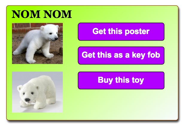
Next up in the Nom Nom widget meeting, is the sales team. They have a very clear goal for the widget, and that is to part the little girls from their pocket money. The important factors for them are the ability to close a sale quickly from the initial impulse to purchase - hence a big 'Buy now' button, and the opportunity to up-sell other products from their line. They propose that instead of just selling the toys via the widget, the company can also offers posters and key rings of the baby animal pictures.
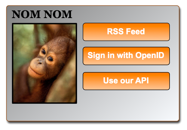
Finally, the technical team have their say. The important thing for them is to use the latest standards in building the Nom Nom widget. They'd like to get the girls to register using a platform like OpenID, and build it using the OpenSocial framework. They want to open up a Nom Nom widget API so that people can make their own Nom Nom widget variations, and add an RSS feed of the baby animal pictures.
Now, all of these product propositions are fine in their own way. However, as Information Architects, our job is often seen as an 'aligning' role. It is a job that attempts to balance the requirements of a business with the needs of the users, and our own dark obsessions with organising everything we ever come across to within an inch of its life.
And all of these widget designs so far miss the mark because they aren't giving the user what they actually downloaded the widget for - big pictures of cute fluffy baby animals.
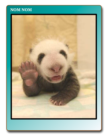
It is important to remember the way in which users will interact with widgets, and one of the guiding principles when building a widget must be that it is something 'personal' to the user.
If we imagine a e-commerce website as a physical place, for example, you might think of a big shopping centre. Lots of people can come and go in the space, and either make purchases or not. Each user is relatively anonymous in the mass of the crowd.
This isn't true of widgets. Once a user has placed a widget on their site or their desktop, it is in an environment that is very personal to them.
For the target age group for this product, downloading a desktop widget is like putting it in their school locker. Adding a widget to their social network profile is like walking around with a lapel badge on. Of course you want that badge to advertise your product, and the availability of other badges, but you also need to allow the user to use the badge to assert their personality, and get what they want from having it.
In this case, it is still big pictures of fluffy animals. But think of other applications - if you want a widget on your site with the latest news from your favourite band, you don't want another band appearing there for a week as part of a 'special cross-promotion' because they share the same record label.
And you need to be really sure that the functionality you are offering works. It is no good offering a widget that offers the latest headline news about Greece aggregated in one handy spot, if your term extraction engine can't tell the difference between Athens, Georgia and Athens, Europe.
So the ability to personalise and customise widgets is crucial to their success. But it is also crucial to offer those options at the right time in the user's journey to install a widget.
Leaving the cute animals aside for a moment, here is a real world example. There is a Yahoo! Widget for the UK based Sky News service. It is a very powerful widget that pulls in the 10 latest headlines on a topic, and allows the user to scroll through them, with thumbnail images for each story. Built into the widget is the ability to change which RSS feed is displayed by default.

Now that is a great piece of functionality, but it also means that anyone wanting anything other than the main headline feed to be displayed has to discover how to use that configuration setting.
Forbes.com take a different approach. They have a page of widgets available. Now, they are all essentially the same widget, except they are pre-tuned to a different RSS feed. Want the 'Business headlines'? Simply download the 'Business widget'. Prefer the technology news? Download the 'Technology widget'.

The Sky widget offers all of that functionality as well, but it is harder to set up.
So, whilst it is important to allow the widgets you develop to be customisable and flexible, it is also important to work out where along the user flow that customisation should take place.
If it is the colour of a widget skin, then it probably makes sense to make it really easy for the user to edit, since they may frequently change their desktop wallpaper or rapidly switch to the latest Wordpress themes as they become available. Bigger decisions, like the nature of the content a widget is displaying, may be best left up-front, before the widget is downloaded or installed.
Next...
In the next part of this series I will be looking at how widgets can make use of the dimension of time.
nice article.. but, you forgot to say that the widget must be contextual: it must enable the user to do something as soon as the user sees the widget. Otherwise it's just a strange banner.