24/7 TV news websites: Part 11 - Search II
Over the last couple of weeks I've been writing about the websites belonging to a group of 8 24/7 news channels that broadcast in English in Europe. In the last part I began an overview of the search facilities offered online by each site - starting with Al Jazeera, the BBC, CNN and the non-existent search facility of Euronews.
Today I wanted to look at search across France 24, ITN, Russia Today and Sky News.
France 24
France 24 has a consistent search box placed at the top of their right-hand navigation column.

In the search results, the term entered by the user is highlighted, and the destination URL of a link is shown. There are no facilities to sort the results in any date or relevance order.
I had some issues with the localisation and layout of the results page. There are some missing spaces in the line that explains how many results have been returned.
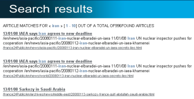
Additionally, France 24 is a French site, and uses French text conventions. However, this means that on the English version of the search results pages, the site uses « & » as quotation marks around the user's search term.
The issue here for me (arrogantly Anglo-Saxon as I am) is that « & » are very commonly used as a conventional short-hand for 'previous' and 'next' on English language search results pages. Since they appear on the page right next to the result count, there is the potential for some confusion here. Of course, if Sarkozy's plan to restrict France 24 to only the French language bears fruit, this will be a problem that just quietly goes away.
One other curiosity with the page is the way that the pagination is done at the foot of the results. For a search generating lots of result, France 24 links individually to up to 100 pages of results. This seems a little excessive when the majority of research suggests that users seldom stray beyond the second page of results for a query, if they even bother to get that far.

(Incidentally, when I did search analytic work at the BBC, I did sometimes notice people calling up the 79th or 80th page of a result set, but I generally put that down to someone scripting to scrape the results, or one of the Biased BBC crew using search to desperately prove that because term 'x' occurred more times than term 'y' on the BBC site, the Corporation was obviously biased in some fashion)
ITN
ITN's search box appears on the right-hand side of their site, as part of the global navigation.

ITN's search results had two unique features out of the sites I have been surveying. Firstly, they bring back an associated thumbnail image with each result. This makes the search page easy to navigate visually, and also allows users to disregard irrelevant results at a glance.
Secondly, at the head of the results, ITN list tags and topics associated with the results that have been generated. This allows the user an alternative way to browse through a topic they are interested in, rather than just taking it in turns to click through all the results. Clicking the tags takes the user through to a page aggregating all the recent stories on a particular topic.
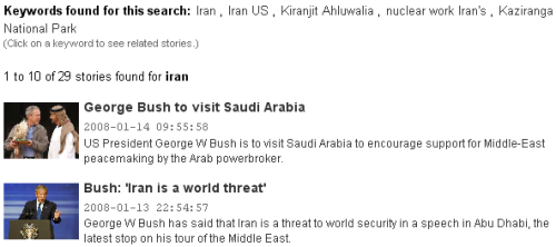
There are no advanced search options. Destination URLs are not displayed, but each entry is timestamped. One nice touch is that, unlike the other sites I surveyed, the entire abstract is also clickable as a link.
Russia Today
Like ITN and France 24, Russia Today also has their search box consistently placed on the right-hand side of the page, as part of the global navigation.

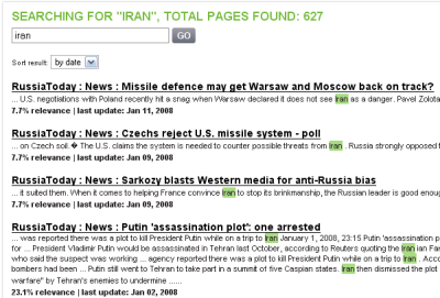
The search results interface is quite plain, although the search terms entered by the user are highlighted in the results. Each entry has a timestamp, but the destination URL is not displayed. Although there is no 'Advanced search' option, users can switch the results to be ranked by either date or relevance.
Sky News
Sky News, like CNN, has their search co-branded with their technology partner, in this case Google. Unlike CNN, however, Sky's search does actually concentrate on returning results from Sky's news content.

The basic search functionality provided by Sky is very simple. Search terms are not highlighted, and there is no opportunity to flip between date or relevancy rankings. Stories are time-stamped, but the destination URL is not shown.
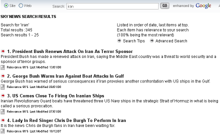
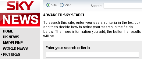
Of the eight sites I've been looking at, Sky News is the only one to provide a specific Advanced Search interface. Users are able to restrict results to a specific date range, by content type (text, pictures or video) or to search over particular areas of the site. The list of options here seems somewhat arbitrary, as major index areas like Media, Politics and Technology are not in the drop-down list. The advanced search page also obviously got left off the last round of re-freshing the Sky site, as 'Madeleine' is still in the primary navigation.
Tomorrow I'll be finishing my look at search across these eight news websites with a feature comparison chart and some overall conclusions.