24/7 TV news websites: Part 14 - Lateral and related navigation I
In the previous post in my ever-lengthier look at the websites of 24/7 TV news channels, I examined some of the types of global navigation that the sites had in common. Today I wanted to start looking at the ways that users are encouraged to move between stories.
In general the dominant types of page on a news site are the 'story page', and the 'index page' which carries links through to various 'story pages', usually arranged into a hierarchy of editorial priorities. A typical browsing session might involve the user selecting a top-level 'index page', for example Asia-Pacific, and then choosing a 'story page' from the content presented by the index.
At that point the user generally has five options:
- To return to the 'index page' they came from
- To look at another 'story page'
- To use global navigation to view a different 'index page'
- To initiate a search
- To leave the site altogether
I was interested in finding out how the sites I've been reviewing facilitate the second choice - how they allow their users to proceed directly from story to story, without returning to the curated index pages.
With sites like Sky News, CNN and the BBC, I was already aware that there is a variety of content that they put into the right-hand navigation of their story pages, and that not every story carries every type of element. Rather than attempt an exhaustive survey of these content types, I sat down one afternoon (Monday 14th January) and followed the top story on each of the 8 news sites that I have been reviewing. I then took a screengrab of that story, and have used it for my comparison. It means it is isn't comprehensive, but it is a time-stamped snapshot of the options and approach across the 8 sites.
Al Jazeera
Al Jazeera feature four content panels in the right-hand navigation of the story page. The top set of options are links to related stories on the same topic as the main story. Next are a set of tools for the user. The third panel features navigational links to the top stories of the moment across all areas of the site. The fourth panel features links to the top stories of the moment from the same geographic region as the main story.

BBC
The top BBC story at the time I took my set of snapshots related to the inquest into the accidental car crash that killed Diana, Princess of Wales. This meant that the story page included many of the main navigational units that the BBC News templates can display.

The related content, as with Al Jazeera, was in the right-hand column of the page again. Andy Rutledge recently criticised three column layouts, but it seems hard for news sites to break-out from this design pattern.
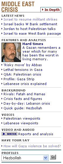
The BBC's related column opens with links to multimedia content connected to the story. In this instance there are then links to in-depth content related to the inquest. With long established narrative, like the War in Iraq or the issue of peace between the Palestinians and Israelis, the BBC often has a more 'designed' in-depth navigation section. This can incorporate several different types of navigational device, like drop-down menus for example.

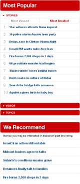
'In Pictures' leads, as the label suggests, the user to related picture galleries. The BBC's Paul Burrell story template also then links to the 3 top stories from the same geographic region as the main story. Finally there is a widget showing users the most read and most emailed stories from across the site at the time. This is a type of feature I will looking at in more depth later this week.
CNN
CNN, like the BBC, has very flexible templates, and so this snapshot of one story does not convey all of the options. At the time I carried out the review, CNN's top story was also about Paul Burrell's appearance at the Diana inquest.
At the top of the story, CNN summarises the key points, and underneath that there is a link to go to the 'next' story in the same major news section - in this case 'World'.

In the main right-hand section of the page, CNN then offers a switchable list of the ten most popular or most emailed stories of the time. Underneath that is a personalised list of stories, recommended to the user on the basis of their browsing history.

There are also expandable sections listing the most popular 'Videos' and 'Topics' available to the user.
Finally, at the foot of the page, there are two 'Top stories' slots for other items current in the news, each featuring a headline and a thumbnail image.
Euronews
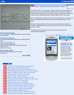
The Euronews story template is very light on lateral navigation features. There is a graphical icon linking to the video that accompanies the text story, and a list of the latest stories across the whole of the site, and no other noticeable features driving the user to look directly at another story.

Tomorrow I will be continuing with a look at how France 24, ITN, Russia Today and Sky News drive users directly between stories.