The BBC's new international homepage beta
Aside from rejoicing over the demise of the pulsing-blue-squares bbc.co.uk logo, I've kept pretty quiet on the development of the BBC's new homepage - despite being invoked by ghenghis over on plasticbag a month or so ago.
"Obviously since it's the homepage, really we need to wait for Martin to tell us what to think."
Most of the angles seem to be covered in this comments thread on the BBC blog - love/hate the clock, too chunky, love/hate the colour changes, too web 2.0 by numbers, love/hate adding stuff and taking it away, doesn't render properly on my 70s Binatone MW radio which I have hacked to run Ubuntu you HTML n00bs etc etc.
However, I haven't seen much comment specifically about the international version of the new beta homepage, which I had a play around with today.
I was involved with the launch of the previous design of the international edition of the BBC's homepage (over dial-up from a laptop in my front room in E17, teleworkers eh?).
The international homepage has always been a slightly awkward proposition for the BBC to get its organisational head around. The user experience of the www.bbc.co.uk homepage (as opposed to news.bbc.co.uk or the also freshly re-designed bbc.co.uk/worldservice) was 'owned' by the central new media team. However a good proportion of the visitors were coming from overseas, and somewhat expecting to see either BBC World television news, or BBC World Service radio, rather than what was going to be on BBC Three next night.
As one piece of feedback from Singapore deftly put it when the BBC's homepage went Doctor Who-tastic for the day - "Does the BBC really think the most important thing going on in the world is what is on the TV in the UK tonight?".
The existing edition of the BBC's international facing homepage now also has a promo inviting users to try out the new beta.

In form and function it is mostly similar to the UK beta.
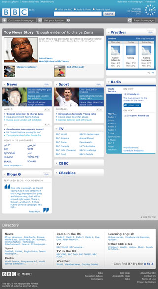
However the largest content area isn't promotional, but editorial, with the top news story of the day taking prominence. Due to the fixed image size being carried by BBC News, this box looks a little light, and could maybe benefit from including a lengthier stand-first from the relevant story.
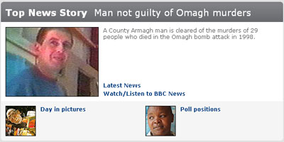
'Blogs' are placed on the homepage as one of the panels present and unfolded by default. When I visited the international edition of the homepage, the featured blog was Nick Robinson. That doesn't seem particularly fine-tuned to the audience the page is trying to address, and I was surprised to see that, in the list of blogs that you could select to place on the page, neither Dan Damon or the World Service language blogs were amongst them.
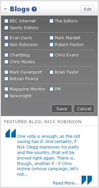
The edition switching mechanism used to be prominent in the header of both the UK and International versions of the BBC's homepage. It is now hidden behind the 'choose your location' button in the banner area. This is inconsistent with the UK version, and there doesn't appear to be an obvious route back to the international edition if you pop to have a look at the UK page.

The choices to be able to customise the content are restricted pretty much to the same choices as the UK at the moment, which is a shame as CBBC and CBeebies for example, are not brands that resonate with an international audience.

One aspect I like about the Weather module, is that when it expands for editing, it specifically states that you are editing your 'international' weather location.
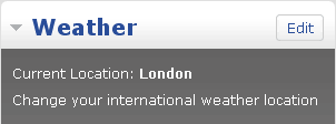
The BBC sets two specific location cookies for weather - one for a UK location, and one for international locations. The former was done to the granularity of postcodes, the latter restricted to major towns and cities. It is pleasing to see this explicitly mentioned for the user.
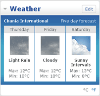
[And yes, that is my Greek 'paradise' cold, wet and miserable for Xmas!]
For the international audience the 'Radio' panel rightly puts the focus on the World Service, although for ex-pats missing The Archers there are links to the UK stations and to the BBC's podcasts.
Personally, I still feel the future for the BBC's international homepage lies in using GeoIP to automatically produce an 'Americas' homepage, an 'Africa' homepage, a 'Middle East' homepage and so on, to bring a slice of global news with local relevance to the whole of the BBC's international audience.
The new page is very much a step up from the last design, which I think, well, actually I know, suffered from producers like me over-analysing every component to ensure that the right compromise had been made between the triumvirate of departments involved. Regrettably, in the process a lot of what was elegant about the proposed design coming out of Bush House was lost.
As an overseas user of the BBC site now, I hope that the international version gets adequate incremental development alongside the UK facing homepage, with some of the custom widgets showing more of the content relevant to the international audience. I'm also unclear at the moment from the design where, of if, the advertising is going to appear.
But, it seems, whichever edition you pick, and whatever timezone you are in, the clock stays... :-)
