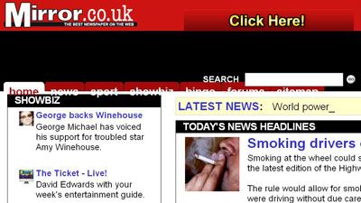
How accessible are Britain's online newspapers? Part 3 - Daily Mirror
This week I'm looking at the level of accessibility built into British newspaper websites. I started with the Daily Express and Daily Mail, and today I want to look at The Mirror. I'm assessing the paper's homepage and top story page against a number of accessibility criteria.
Text resize
One of the simplest tests for accessibility is to see whether a site uses relative font sizes or fixed font sizes. Relative font sizes means that users can control for themselves the size of the font using the settings within their browser. The Mirror site allows users of Internet Explorer 6 to resize text, but in Firefox, changing the font size breaks the layout of the page.

Alternative image text
The Mirror performed well on tests for the presence of alternative image text. All images seem to have descriptive text, although some of them did also include an agency credit. I suspect this was included for legal considerations rather than accessibility ones - certainly I'm not clear why this information should be considered vital for someone who can't see the actual image, whilst being hidden from anyone who can.

JavaScript unavailable
Another test I have been carrying out is what happens on a newspaper website if JavaScript is enabled. This doesn't just affect people using assistive technologies - as a general rule of thumb when designing applications at the BBC I used to work on the premise that we were unable to detect active JavaScript on around 10% of users.
I only found one instance of a lack of JavaScript causing problems on The Mirror's site. Whilst it was easy enough to comment on their blogs, there was some difficulty in registering to take part in The Mirror's forums. During the sign-up process, they use links to the Terms and Conditions and Privacy Policy that could only be opened as pop-ups when JavaScript was enabled.

Browsing using FANGS
Screen reading technology is used to render a website in audio, and an add-on for Firefox called FANGS emulates this type of output in text. I've been testing the newspapers sites to see how they work in these conditions, and to judge how long it takes for users of this type of technology to get to the content of a site.
The Mirror's site performed second best out of the eight newspapers I'm looking at, being pipped to the post by The Times.
On The Mirror's homepage it takes the user 228 words in FANGS to get to the top headline. A story page is even leaner, requiring only 97 words to get from the opening announcement about the layout of the page to the main content. This makes 325 words, just 4 more than The Times.
However, The Mirror could give even more help to those using assistive technologies by including a 'skip navigation' or 'go to content' link, and adding accesskeys into the HTML. Neither of these accessibility features is currently present.
Another problem with The Mirror's coding is that without the visual layout, a screen reader relies on the semantic prority of the <H1>, <H2>, <H3> (and so on) tags to understand the relative importance of the stories. In The Mirror's code, it is the name of the newspaper that is enclosed in a <H1> tag, and section headings that get given a <H2>. Headlines, whether they are the main story on a page, or some navigational teasers in the left-hand navigation, are coded as <li> list items, meaning it is not so meaningful to skip through the page by heading.
In the next part of this series, The Guardian's myriad of website designs will be having some of their accessibility issues put under the spotlight.