How accessible are Britain's online newspapers? Part 1 - Daily Express
The 1995 Disability Discrimination Act put the force of law behind the principle that businesses should not discriminate against people with disabilities in the provision of their goods and services.
Although yet to be tested by major case law in the UK, it is generally accepted that 'services' includes a business web site, and that therefore businesses should take care to make sure that their sites are as accessible as possible.
In theory, this is trivial to accomplish.
All that needs to happen is for a business to insist that their site is made with standards compliant XHTML that can be rendered in a variety of media. A business also needs to make a couple of simple decisions about actively supporting accessibility. This needs to be done not just in the code of the final page but also in the content management process. A good CMS will ensure that elements like alternative image text, for example, are compulsory, and captured at the time content is written.
Sadly, many businesses seem to think that developing a website that can be viewed correctly in one browser on one operating system is as much as they can cost effectively do, and in doing so they make decisions that compromise the accessibility of their content.
Over the next couple of weeks I'm going to be looking at the accessibility of the websites of eight major British newspapers - The Daily Express, Daily Mail, Daily Mirror, The Guardian, The Independent, The Sun, The Telegraph and The Times.
Although, on the web, newspapers are increasingly diversifying from replicating print content into making unique web content, audio, and even video clips, their main business of delivering news, entertainment, and information via text should be ideal for making an accessible site.
For each newspaper I've been testing the homepage, and the top story on that page at the time. I carried out the testing in early October. Later in the series I'll be writing a bit more about the methodology that I used.
Sadly, as we will see, British newspapers on the whole put a lot of barriers between a user with accessibility needs and their content and advertising.
I'll be looking at the newspapers in (roughly) alphabetical order, and so today I'm starting with the Daily Express. [1]
Text resize
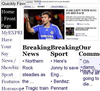
Giving the user the ability to set the font size that they view the web with is one of the simplest ways to provide accessibility for users with eyesight problems. The Daily Express doesn't allow this, using a mixture of fixed font sizes and Flash to deliver content.
In Internet Explorer 6 the user is simply unable to resize any element of the page. In Firefox, the user is able to resize some of the HTML text, but not the main content window which is delivered in a fixed size Flash movie. The HTML layout size is also constricted, so increasing the font size in Firefox breaks the layout, and renders some content overlapping and unreadable.

Alternative image text
The majority of users only notice alternative image text when there is a broken image on a page, or if they have a slow connection. However, it is an essential accessibility element, which is meant to replicate any text contained in an image, and to describe the content of an image for users with accessibility issues.
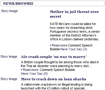
The Daily Express does include alternative image text on its homepage, but it isn't particularly helpful. The image accompanying every story is labelled with the truthful but unimaginative "Story image".

Hearing this read out repeatedly by screen-reading software must be quite grating for the visually impaired user of the site.
Of course, that is if the user understands which site they are actually visiting - there is no alternative image text on The Daily Express masthead either.

JavaScript unavailable
Assistive browsing technologies can struggle if a site relies on JavaScript for key functionality. This doesn't just impact on people with disabilities. It is also possible that people will be browsing without JavaScript because of a very strict corporate IT policy, or because they possess an unearthly paranoia about the risks involved in allowing unknown JavaScript code to be executed on their machine.
Although browsing the Daily Express site with JavaScript switched off didn't expose to me any major problems with accessing content, some of the navigation on the site was impaired.
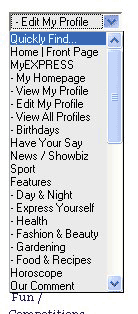
For example, near the top of the their left-hand navigation they have a 'Quick Links' drop down menu to help people get to the major sections of the site. However, only people with JavaScript enabled can actually select the links.

Likewise, nearer the bottom of the page they have a module with similar drop-down links to horoscopes. Without JavaScript, the user is unable to select their specific star-sign.
Browsing using FANGS
During this set of accessibility tests I've been keen to understand how newspaper websites are rendered by screen-reading software like JAWS. I've watched JAWS being used by a proficient blind web user, and realise that it would take some time for me to get used to how it works, and to be able to browse at the kind of speed that was demonstrated. So, instead of using JAWS, I've been using FANGS.
FANGS is a Firefox Add-On that emulates the output of screen-reading software like JAWS, but represents it on the screen as text. This is much closer to my usual way of browsing the web, and so is easier for me to understand and to measure.
The test I have been carrying out is to understand how easy it is for a screen-reader user to find the main story on a newspaper homepage, and then, having followed that link, how quickly they can get to the main content of that story.
The Daily Express performs abysmally on this test.
The top stories from several sections of the Express site are included in a Flash module near the top of the page.
There seems to be no accessible replacement for that content for users who do not or can not render Flash, and so, the main story of the day does not appear in a screen-reader rendering of the page.
Users of screen-reading technology are effectively excluded from the main content of the Daily Express homepage, unable either to read the headline, or navigate to the full length version of the story.
There are no accesskeys included in the page code, and there is no 'skip navigation' or 'go to main content' link near the head of the page. This means that to get to the 'breaking news' section (which effectively becomes the first set of headlines available to a screen-reader user), the software has to read out 252 words. Once a user has navigated to a story, it is then another 292 words until the main content starts - 544 in total.
If you think those figures sound high, then you are going to be surprised to find that actually, for the content that is available via this type of software on the Express site, this is quite a low number of words to wade through. As we shall find out, other newspapers literally put thousands of words of navigation and promotional content in the way of visually impaired users reading the main stories on their pages.
Tomorrow, in the second part of this series, I will continue by looking at the accessibility of the Daily Mail site.
[1] I've realised I'm slightly inconsistent about whether titles have 'Daily' in them or not, but this is the order I've got used to working in now, so I've stuck with it. [Return to article]
Journalism.co.uk have an excellent article on the accessibility of The Express, testing the newspaper with real users.