Orange could do with a usability upgrade
I used the Orange online service last week to upgrade my phone - and I have to say I was left distinctly unimpressed with some of the usability.
I still retain a UK mobile phone for when I'm in the country. It means that I've been able to keep the same number that I've been giving out since the year dot on business cards and email signatures.
However, if you've tried to call me on my UK phone over the last couple of months, pretty much all you will have got is me bellowing: "Hello....hello? No, sorry. I can't hear you. It's the phone. I need a new phone. Send me an email."
I've had a Sony Ericsson T610 pretty much since it came out, but the volume it produces is now so low that after many years of working in record shops, DJing, and listening to my Walkman / MiniDisc player / iPod far too loud, I can't hear a thing through it.
So a new phone it is.
The first thing I tried to do on the Orange site was log in to my account. There are several text entry boxes on the orange.co.uk homepage. Once I'd established I didn't want to use the confusing extra box in the promo for the Orange toolbar, or their web search, there was an opportunity to put in my email address and password.

Now, I'm fairly certain that the unique identifier of my Orange account is my phone number, and I've always logged in using that before. Maybe this email thing was for their new web-based customers?
Anyway, I was a bit confused, so I clicked "Your account".
That took me to a page that presented me with a choice of logging in using my mobile account, or of logging in with my internet service account.
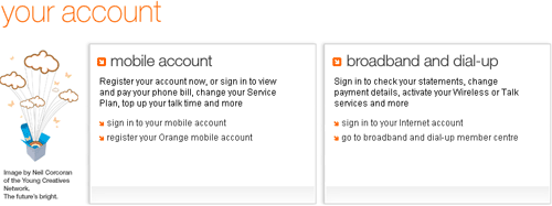
That was an easy choice for me, so I clicked a link labelled "sign in to your mobile account". The other option under mobile account was to register my Orange mobile phone account.
Then I was taken to a page....which asked me whether I wanted to register for an account or sign-in.
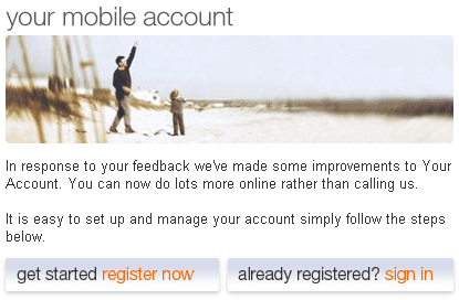
I began to get slightly aggravated at this point. Surely that was exactly the same choice I had been given on the previous page?
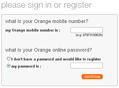
So, for a second time, I indicated that I wanted to sign in, not register, and finally, on the fourth screen I'd been shown since typing in orange.co.uk, I was able to enter my phone number and password.
But hang on a second.
This form says 'sign in' or 'register'. After I put my phone number in, I then had to tick a selection either to register or to enter an existing password. So it looks like Orange have asked me twice in succession whether I want to 'sign in' or 'register' - and then have taken me to a form where I can do both anyway.
Once I got past that step, I was given a screen full of options of things that I could do online with my account.
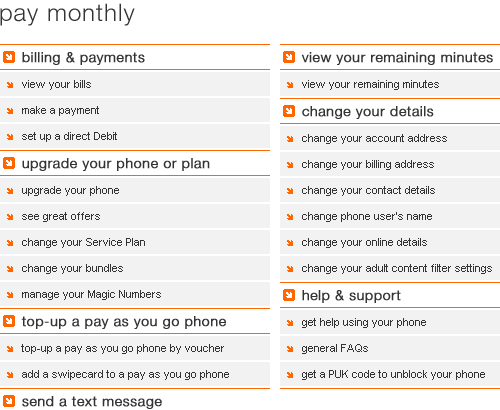
I wanted to find out about upgrading my phone - and helpfully there was a prominent link there for me to do just that. I clicked the link labelled 'upgrade your phone'
To my astonishment, I was presented with a second page of options, which included 'registering' for an account again. And 'upgrade your phone'.
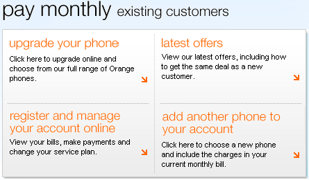
So, I clicked again on an option to find out about 'phone upgrades', and finally I was able to see which phones were available for me.
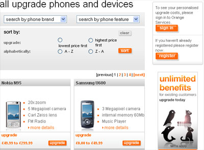
But what's that in the top right-hand corner of the upgrade screen?
Sign in?
SIGN IN?
You mean to tell me that after all the performance so far, and 7 screens full of repeated menu choices and information, that I'm still not actually logged in properly?.
That wasn't the end of the trauma, although I don't have screenshots for the rest. Suffice it to say that I was already ill-disposed towards the process by now, so found the e-commerce bit full of usability issues too.
Not least of which was the on-screen promise that you are on step 1 of a 4 part journey, then step 2 of a 4 part journey.
Then you get to step 3, where you enter your postcode. Then step 3, where you confirm your address. Then step 3 for a third time, as you confirm a shipping address. Which makes it a 6 step process to my mind.
The Terms and Conditions that you were presented with during the process were also particularly unhelpful.
They consisted of a long list of chapter titles, and when you clicked on the chapter heading, it expanded to show the exact T&C's.
Which would be fine, except that there were, it seemed, in excess of 30 chapter headings, and they covered everything the Orange lawyers could possibly ever want you to agree to, including time limited special offers. So you couldn't actually tell which bit of the document was relevant to the transaction you were carrying out.
Naturally, like 99.9% of internet users, I opted to tick the box that said "Yes, I have read all this, no, honest guv, I did".
Presumably, somewhere in the legal jargon I also agreed to something that I didn't think was actually legal - allowing them to vary the price at their discretion, after I'd agreed to the price of the transaction.

Quite what information about the products and services I am subscribed to that Orange don't have to hand is a difficult one for me to fathom.
Having looked closely at the URLs during the process, my wild uninformed guess is that they have some data protection or architecture issues when passing information between www.orange.co.uk, services.orange.co.uk and shop.orange.co.uk.
I'd also suspect from my telco website experience that the Orange portal, the account management services, and the online shop are all being run by different bits of the business or different out-sourcing arrangements - hence the lack of joined up user journeys.
However, in raw usability terms of assessing whether I performed the task, I did. Despite the frustration and repeated choices, a bright shiny new Nokia N95 is waiting for me in the UK.
I got an email confirming the shipping of the order, and a text message telling me the phone was on its way. The SMS allowed me to reply with a simple numerical 1, 2, or 3 if I wanted to shift the day of delivery along the week if need be.
With that part of the user experience being so good and so well thought out, it is just a shame that the web part of my user journey was so painful.
Orange have never had much of a clue when it comes to web sites. Last year I wrote about their business web site. They did a major upgrade and stopped it working in anything other than IE.
I was an Orange customer for twelve years, but earlier this year I decided that there was no good reason for staying with them and switched to O2. And I'm very happy with that change.
I have NEVER managed to do anything with Orange online. Even when I contacted technical support, they didn't manage to make it work. So I went in this morning just to see what would happen. For once I managed to log in. To be presented with a helpful page saying:
"These are the Orange accounts that you have setup online. Please select the link of the account you wish to manage."
Just one problem. There wasn't a single hyperlink on the page!
I think what you wanted was a PAC, not another phone from the shoddy muppets at Orange.
I've had my own 'fun' experience with orange recently:
My phone developed some sort of fault that was murdering the battery, so i thought a quick trip into an orange shop for a speedy replacement of a demonstrably faulty handset would be relatively painless. Oh no. As an online customer i have to phone customer support to report the fault. Only they couldn't help and were going to call me back the next day with a solution (they didn't).
The best bit was the next time i phoned customer support to express my displeasure, before i got through to an operator i was challenged to enter my password. I don't know my password, and i couldn't get through to an operator to reset it because the whole process stalls at that point until you pass the test.
Online password reset? no problem. Apart from my web password apparently doesn't line up with the customer service one.
email help? No account information given out of email for security reasons.
But my phone mysteriously started working again so that's a problem for another day.
< /rant >
My phone? An N95.
I have just tried to upgrade my phone online and had identical experience with page after page of registration rubbish then when i finally made it and ordered a phone i got an error message . Farcical.
How long does it take for an orange upgrade to actually arrive? I apparently upgraded my phone on wednesday 29th. It is now 3rd November and nothing has come out of my account, i have received 1 email saying thank you for upgrading and thats it. Does it really take over a week to send a phone?