Reckless Records RIP - Part 6: Digital Penetration
(or "Everything I know about second-hand record retail I learnt by being rude to customers at Reckless Records" by someone a bit like that bloke in 'High Fidelity')
Last week I started a series of posts writing about my experiences working at Reckless Records during the 90s.
I wrote about when Record Collector ruled the world, serving customers nick-named 'Wig Wearing Wanker' and 'Wee-Wee Reggae Man', relationships via fax with record stores in Japan, and the sometimes insane UNIX based computer system the shop used to use.
Inadvertently, working at Reckless got me into doing what I do today, since it was at the Soho branch that I first really started to regularly access and understand the internet.
We had dial-up internet access from Direct Connection in the shop, and were using Eudora for email and Netscape for surfing the web. The manager's desk in the Soho branch was where I had my "Eureka!" moment of realising that you could view the HTML source of a webpage using Netscape.
And then learn yourself how to put one together by reverse engineering it.
It was in 1998 that I began to start making my own websites. As well as looking at how existing sites were coded, I bought myself a book called "Learn HTML in 21 Days."
I didn't have a computer at my bachelor pad, and so I taught myself HTML using the book, plus a pen and paper, mostly whilst sitting in The Flowerpot pub on Wood Street in Walthamstow. I would then type the code in and check it when I had spare time to do so at work.
As I was getting going, Reckless had just decided to re-brand from the black-and-white outstretched hand logo that the associated record label used, to a mushy red-and-yellow logo.


Which meant that the very first full pages of HTML I ever marked-up were done in Microsoft FrontPage, using yellow text on a red background.
Nice.
Thankfully, Reckless had got someone who knew a little bit more than me about what they were doing to develop a website for them quite early on after the internet had began to make an impact in the UK.
However, it had been left untouched for some time, and even my smattering of beginner's HTML was enough to be able to edit it to reflect updated opening times and telephone numbers following one of London's periodical dialing code changes.
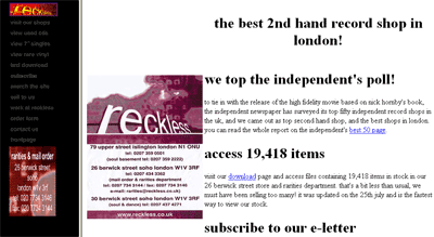
Another thing I did was switch the site from its original address, which would have been something like www.dircon.co.uk/users/~reckless to reckless.co.uk. Being able to achieve this was sufficiently advanced enough to appear like magic to the rest of the business, and very soon I was in charge of the website, and of building a new one that also featured more regularly updated lists of stock.
Because staff had to work at least one day on the weekend, and the working day, being 10-7, was slightly longer than the standard 9-5, most staff at Reckless only worked a 4 day week.
Towards the end of my time there, the company paid for a PC to be located at my house, so that I could do an additional fifth day from home, working on the shop's website.
Whilst it is now how I do the majority of my work - on a computer at home - at the time it was a real treat. It seemed very futuristic to be able to get paid by a bricks'n'mortar business for working in the (then relative) comfort of my own home.
I used to have to dial directly into the server at Reckless in order to log on via TELNET when I was working. I never quite got the terminal set up to display entirely correctly. I also had to be available on a mobile phone as well, in case the support team in the USA had to dial into the one dedicated line to the server at the same time.
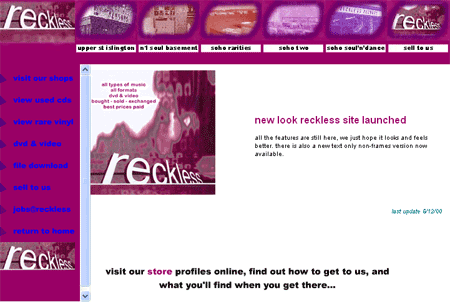
The, thankfully long gone, site I built for them was very much a beginners effort, with some severe usability problems, but, you know, everybody has to start somewhere.
Initially all I did was re-style the left-hand navigation of the site to reflect the updated Reckless branding. Of course, being the late nineties, the site was using framesets.

Subsequently I built them a site with an even more complicated frameset, which also used Flash for navigation. It had swathes of rollover graphics, text that was too small and wasn't resizeable, and used a stylesheet that forced everything into lowercase. As, please be assured, was absolutely de rigeur if you were just learning a smattering of HTML at that time.

The site also contained an online listing of the stock of the 26 Berwick Street store.
It wasn't updated in real-time. It was painstakingly updated by me, by hand, once a week. The BYRON system from Wallace Haines produced a data-dump of what was allegedly in stock in the store, and it did this in an almost entirely unsuitable format.
I then had to perform a series of data manipulation actions that could almost certainly have been automated had I known even a cursory amount of Perl at the time. Or probably even if I'd re-booted my old ZX Spectrum or dusted off my BBC Micro BASIC.
Instead, I had Microsoft Excel to hand, so wrote a series of Macros that would strip out awkward characters, sort things by genre into alphabetical order, suppress some fields and concatenate others, and ended up with a lengthy series of text files.
These then had to be FTP'd to the live site, one at a time, over a 56Kbps connection.
Whenever people wonder how I cope with my internet connection in Greece being at a blisteringly slow 28.8Kbps, I always smile and think of having to update a supposedly dynamic data-driven site over 50-odd Kbps and how long that took. I usually reflect that since at home I only want to pick up my emails and read a few RSS feeds, it isn't as bad as all that.
And at least I'm not still trying to make Flash promotional banners that have to load over dial-up.
You might have to hang on a second to see this looping Flash promo horror spring into action again.
In the next part of this series I'll be looking at a time when Reckless featured on television in CNN's World Business Report.
Ah, 1990s style websites. Those were the days ;) Quality designs, which live on in some ways in places like MySpace...