Sony Connect music download store relaunches in Europe - part two
Yesterday I was writing about the new design of Sony's European 'Connect' music download store. Before Christmas I worked on the information architecture and wireframes for the relaunch of the service.
As ever, during the course of a web site launch some compromises have to be made between design and implementation, and there are some areas of the new version of the site which I don't think are yet working to their optimum, or quite as they were designed.
Some of these are minor irritations, whilst some have more of an impact on the user experience, and today I wanted to focus on those.
Crumb-trail character length problems
One thing that I dislike is the way that long strings of characters are truncated in the crumb-trail navigation.
Whilst I appreciate that for aesthetic and practical reasons very long artist names and album titles need to be abbreviated, at the moment the way it is implemented is not terribly intelligent. The strings are truncated according to whether each individual field exceeds a specified length, rather than whether the crumb-trail as a whole has exceeded a specific length.
This leads to examples where the crumb-trail is truncated unnecessarily - for example on this promotional page for Sony's higher quality download format. Although the title of the promotion itself is long, since there are no further tiers of the crumb-trail there is no need to truncate.

This contrasts unfavourably with the kind of logic used on the BBC homepage to judge headline length. Here the character length of all three headlines together is calculated. If that is over a maximum limit then the third story is dropped from the panel.

"SPECIAL OFFER" labels
Another area that I don't quite think is right yet is the labelling of the links in the "SPECIAL OFFERS" navigation panel.

At the moment in the UK store there are three links in this section, only the second of which - "Rhino Hi-Fives" - particularly describes well what the user will get when they click the link - in this case a promotion for a set of products from the Rhino label called "Hi-Fives".
The third label, "High Quality Downloads", sounds more like it will lead to an FAQ style description of Sony's ATRAC format. In fact, it goes through to a limited range a Jazz and Classical downloads available in the premium ATRAC Advanced Lossless format.
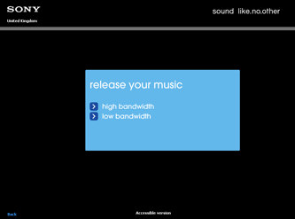
It is the top label that gives me the most problem though. "Release Your Music" means nothing to me in understanding what I'll get when I click it. If you do click it, rather unexpectedly it opens a brand new window and goes to an entirely different Sony site. The first thing you get is a splash screen which still conveys no idea of what you are actually going to get once you've chosen your connection speed.

Metadata quality and the impact on search and browse
An area which can't be improved at the technical implementation or information architecture level, but which has a serious impact on the user experience, is the quality and consistency of the metadata supplied by labels when their digital content is prepared for the store.
In the example screen-shots I was using in yesterday's post about the improved browsing routes through the site, I was mostly using examples from the content of Depeche Mode - which typifies some of the common metadata errors that occur during the content ingestion process.
The track "A Pain That I'm Used To" for example, contains a typo in all formats, with the 'm' in I'm appearing in upper case.
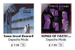
Additionally there is inconsistent capitalisation of album titles throughout the content pool, typified by this side-by-side example of "Some Great Reward" and "SONGS OF FAITH AND DEVOTION".

These might seem like pedantic points to make, but this actually has far-reaching consequences for the user experience, since the way that the search and browse functionality on the site is implemented is case sensitive.
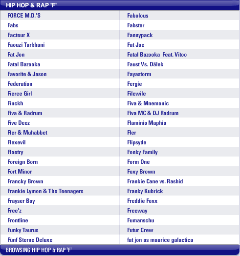
This is illustrated by looking at the A-Z page for the letter 'F' in the Hip Hop & Rap genre on the UK edition of the store.

Here you can see that because of case sensitivity, the all upper-case "FORCE M.D.'S" head the list, whilst the all lower-case "fat jon as maurice galactica" bring up the rear, even though neither are in their proper alphabetical slot.
On this page it isn't so bad, as all the artists for this letter and genre fit in the one display. However for letters within genres where the list is longer and paging is required, any artist with lower-case characters starting their name are relegated to the foot of the alphabetical list. This is confusing for users.
Technical platform constraints
Sadly, the Sony Connect store is still only available for users of the Windows OS platform, using the Internet Explorer browser.
From a business point of view, I understand that the cost associated with implementing Sony's ATRAC DRM solution onto minority use operating systems is prohibitive in terms of the return that can be expected in sales.
However, personally, I feel that the Internet Explorer browser lock-in is unnecessary
The SonicStage software uses the Internet Explorer browser engine to display the web store, and so it is understandable that the experience and the behaviour are optimised for that experience.
However, one of the crucial market differentials between Sony Connect and the Apple iTunes store is that you can come into the Connect store without having to install the music management software first. Users can browse the range of content and the special offers that are available over the internet, before deciding if you want to use the service to actually purchase music.
By locking non-Internet Exporer uses out of this browse experience, Sony are locking out something like 10% of their potential market.
Technically it ought to be possible for users to browse the site on the web using Firefox or Opera, and to only need to have Internet Explorer installed on their machine for SonicStage to work, not for Internet Explorer to be required to be their internet browser of choice.
This seems to me to be even more the case with the new design, which uses the cross-browser Flash plugin to render the majority of the content on the pages, and I think it is a shame that Sony didn't take the relaunch as an opportunity to support the service in more than one browser.
On the whole though, as I said yesterday, I am generally happy with the relaunched store, and think that, within the technical constraints it was launched under, it provides a real improvement on the previous version of Sony Connect.