Newspapers 2.0: How Web 2.0 is The Mirror?
I've been looking at the extent to which the online versions of British newspapers have adopted the technologies of web 2.0 - things like RSS feeds, blogging and social bookmarking. So far I've looked at The Express and The Times, and today I'm looking at The Mirror.
The Mirror's most recent redesign on the web has been without doubt one of the ugliest attempts yet to spray-paint a little web 2.0 gloss on a postively web 1.0 user experience. The banner and tabbed navigation positively scream "Look, we've just read an online tutorial on how to do gradients in Photoshop".

The new homepage features a couple of embedded video panels, powered by Roo, but little else in the way of web 2.0 style features.
RSS feeds
The Mirror has an RSS feed of the main headlines. This is auto-discoverable from the homepage, although there is no mention on the page of feeds or RSS at all.
This is surprising, given that they have a large number of links in the navigational footer of the page, which includes not just top-level categories like 'News' and 'Sport', but also more granular and commercial items like 'Slimming', 'Poker' and 'Mirror Shopping'.
Looking at the navigation I was somewhat at a loss as to understand what the difference between the 'Showbiz' and 'Entertainment' categories was going to be, and I also noted that despite there being no room to mention their RSS feed, they were able to include two links to 'Music Downloads'.
The Mirror's use of RSS is more prominent on their story pages. The feed is still auto-discoverable in a browser, and there is a promotional link to the "Top Stories RSS Feed" in the right-hand navigation of the page.

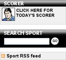
This RSS promotion is related to the category the story is indexed under, and so varies, for example, on sports pages, by leading to the sport RSS feed. Of the online papers that I have surveyed, The Mirror is one of only two to do this.

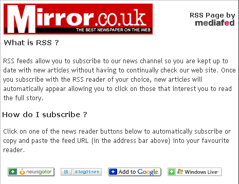
Following the Top Stories RSS Feed from a news story page takes you to a formatted version of the feed provided by Mediafed. This includes some contextual help for those new to RSS, although the Mirror itself does not appear to have any kind of "What is RSS?" help content. The RSS feed tells users that:
RSS feeds allow you to subscribe to our news channel so you are kept up to date with new articles without having to continually check our web site. Once you subscribe with the RSS reader of your choice, new articles will automatically appear allowing you to click on those that interest you to read the full story.
The RSS stylesheet includes four buttons to directly add the feed to your favourite readers - Newsgator, Bloglines, Google and Windows Live.

However, the stylesheet doesn't seemed to be called by all feeds. The sport feed, for example, has appeared to me as raw XML when selected from this Champions League draw story.
Mirror Blogs
When I've been looking at what British newspapers are doing in terms of Web 2.0 "features" online, I've also been looking at their blogging habits - and The Mirror online has "Blogs" as one the 6 primary navigation tabs in the header of each page.
They may be pushing the blogs hard from the homepage, but it looks to me like they could do with a bit of work on the content side of things. On the day I surveyed the blogs homepage (March 9th 2007) the topics covered included such earth-shattering content as explaining the premise of 5-7 million rated TV show "Life On Mars", I got given a PlayStation game for my birthday, and 150 words that amounted to nothing more than "Look, UEFA have done the Champions League draw, and isn't it weird how Leeds were once in the Champion's League and are now facing relegation"[1].
Like many newspaper efforts, The Mirror's blogs can't 100% claim to be blogs. They have RSS feeds and permalinks, and allow commenting, but notably there is no forward and backwards navigation at the individual post level. That means that the only way of navigating to individual posts on the blog once they have dropped off the homepage is via the tag cloud or archive links in the right-hand navigation.
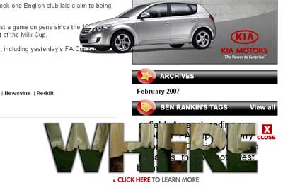
A feature I wasn't so keen on when browsing the site was an intrusive advert. I'm used to flash-driven ads that are overlaid on the page, and understand, unlike some, that commercial websites need to earn advertising revenue. However, on The Mirror's blog pages the adverts breached a cardinal rule by obscuring the navigational elements of the page, without an off switch in sight.

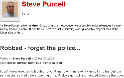
They have opted to add a personal touch to their blogs though, with pictures of the author and a 'blurb' at the head of each index page. Blog posts also have tags attached to them, which build into a navigational tag cloud in the right=hand side of the page - when it isn't being obscured by advertising, obviously.

The Mirror either have an aggresive moderating policy, or are they are yet to build any kind of community around their blog offering - the majority of posts I saw had attracted between 0 and 4 comments, and the largest number of comments I saw on any individual was 10.
They obviously see their target market for blogs as including a significant proportion of users who are new to the concept, as they provide an extensive introduction to the idea.
Welcome to the Mirror.co.uk blogs! This exciting new area of our site will allow you to read and comment on the things we’re all talking about. Many of our award winning journalists will be keeping a blog and this is just the beginning. In 2007, we'll be giving you the opportunity to become a Mirror.co.uk "citizen journalist" where your thoughts on topical events will be posted right alongside ours!
If you’re new to blogging read on to see how you can get started.
What is a blog?
Blogs (weblogs) are online diaries or journals which can be read by anyone and which allow readers to give feedback in the form of comments. Although there are many different types, the basis of blogs is that they are web pages which are regularly updated, with the most recent post appearing at the top of the page.
Blog pages layout
Each blog page is made up of different elements which tell you who wrote it, what it’s about and how you can comment on it. On the Mirror.co.uk blogs you’ll see the name of the author beneath the title, along with the time and date it was posted. The tags (category) line shows the keywords for the blog highlighting the subjects it covers. You can click on an individual tag to read more blogs around a similar topic. For example, clicking on a tag named fashion will take you to a list of other blogs which are also fashion-related.
Social bookmarking
The Mirror's site incorporates two different sets of social bookmark buttons, depending on where you are.
In the main body of the site, alongside "Print this" and "Email to a friend" links, are links to post a story to Digg or bookmark it with del.icio.us
Blogs carry more links though, and the new to blogging page I mentioned earlier carries a brief explanatory note about them.
Sharing blogs
At the bottom of each post you’ll see a line that says
'Post to: del.icio.us | Digg | Blinklist | Magnolia | Newsvine | Reddit'.
These are all social bookmarking websites that enable people with similar interests to share their favourite blogs and discuss what they are reading. To send a Mirror.co.uk blog to one of these websites simply click on these links.

Of course, that is slightly untrue, as you need to be a logged in member of the services for it to be a one-click operation, and personally I feel that if they are offering that range of bookmarking services on their blogs, they should be consistant across the site as a whole, and offer the same set of six on their main content as well.
Web 2.0 verdict
The Mirror seems to be ticking all the right boxes, but somehow the Web 2.0 technology seems as loosely stuck on to their site as the garish navigation tabs in the header look stuck on.
There are blogs on the site, but with little in the way of interesting comment and community. Whilst the blogs have social bookmarking widgets atttached, with no content worth bookmarking what is the point? Furthermore advertising has been allowed to dominate usability, which is a sign that the user is not being put at the heart of thier processes.
The Mirror's implementation of RSS is better than their blogs, but still patchy. With some feeds appearing stylesheeted, and others not, it again gives the impression that there is no overall RSS strategy, or effective quality control across their Web 2.0 features.
Next...
In the next part of this series I shall be looking at the Web 2.0 credentials of a newspaper that has recently been making waves with their aggresive marketing claim to be "Britain's No.1 quality newspaper website"" - The Telegraph.
[1] Although, as a Leeds United fan myself, perhaps I was just personally bitter about that post ;-) [Return to article]
Interesting how you pick on the 'previous' and 'next' links as being a crucial blog feature.
Whilst I agree that it's a useful navigational item, there's plenty of widely-used blog templates that don't include this.
I'd say that a more interesting analysis of supposed 'blogs' would look at:
* Whether the author responds to comments at all, either in the comments or in follow-up posts.
* Whether posts link out to other blogs or not (ie whethere they actively take part in the 'blogosphere').
* Whether the blog is updated regularly or not, and whether or not it contains a mix of thought-out articles and shorter off-the-cuff comments.
Interestingly, it seems to me that many journalist written blogs (including the BBC's) start out behaving completely un-blog-like, more like a newspaper columnist, and then slowly adapt to the format.
Frankie
>> Whilst I agree that it's a useful navigational item
I'd go a bit further than saying it is useful - surely if you can't turn the pages of a blog directly back and forth it breaks the chronological posting model that is pretty intrinsic to the form?
Your other points about measuring the quality of the "blogginess" of a newspaper blog are good ones, and I think most of them will be covered during this series when I am looking at newspapers doing it well, or more likely, doing it badly.
>>I'd go a bit further than saying it is useful - surely if you can't turn the pages of a blog directly back and forth it breaks the chronological posting model that is pretty intrinsic to the form?
I think the chronology comes more from the fact that you become a regular reader, and follow the blog over time. The previous and next links are more useful for first-time readers wanting a 'catch up', or wanting to rewind back a few posts to re-read something they saw on the homepage a week ago.
So I don't the absence of the links 'breaks the form'. It's a fairly recent convention after all.
Frankie