Playing with the Virgin Radio player beta
I was nudged the other day into looking at Virgin Radio's beta test of a new streaming internet radio player. The limited testing is only open to those who have registered as VIPs on the Virgin Radio site, which was a nice way of getting a small group of enthusiastic users of the site to try out the new service.

My first impressions of the player were very good. Apart from having the streaming area and radio controls, the player features content areas as well. There is an encouragement to interact with the show on air via email, text and the telephone. It also offers integrated music news headlines, and the opportunity to watch videos as well - yet another example of the internet enabling radio and radio stations to break out of their spectrum scarcity driven audio-only constraints.
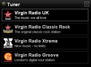
Of course, as much as 21st century radio mutates across platforms, it also retains the heritage terminology of the old days. Thus the Virgin player beta allows you to switch between channels, and opts for the quaint label of "Tuner", even though there isn't a hint of 'tuning' involved in internet streaming.

Slightly confusingly, as they represent very different functionalities, I felt the icon chosen to indicate tuning was very similar to the iTunes podcast icon.
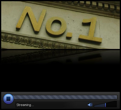
The Virgin player beta offers a choice between serving the stream in Windows Media Player format, or as a streaming Flash player. Of the two, I much preferred the Flash version, as the player looks much nicer without the Microsoft Windows Media Player controls intruding into the design.

I'm not sure if there are cost or the availability of streaming hardware issues, but I'd think that Virgin would provide a better overall user experience and product by serving the stream in the Flash player by default rather than the Windows Media Player experience.
I had only one usability gripe about the player, and it was a pretty minor one at that. In the default opening view, there are five news stories available to view, and you can switch between them by mousing over a navigational device at the foot of that content area.

The two problems I saw with this, was that firstly it is quite a non-standard way of selecting different items, and I wondered if they might not be better off using something like directional arrows at either end of the dots to indicate more intuitively to the user that they scroll through a number of items.

My biggest concern, though, with this feature was that it required great dexterity with the mouse in order to be able to pinpoint a mouse-over area that is a 16 pixel square. I'm not convinced that anyone with even a small impairment of the visual or motor abilities would be able to hit it bang on the button and hold the mouse there to read the text.
I often think that as part of the web development process designers and developers should be made to try and use their sites wearing some slightly off-prescription glasses and a glove that interferes with the ease of using a mouse, just so they can see how anyone without 20/20 vision or full mouse control gets on.
On the whole, though, I really liked using the Virgin player beta.
I thought the interactive elements were pleasant to use and click around, the streaming started up quickly and was of good quality, and I liked the idea of allowing their registered VIP members to have an early peek at the digital future of the stations.
However, some things technology can't overcome, and the opening strains of Suggs playing Bruce Hornsby's "The Way It is" were enough to make me close the window and scurry back to the safety of the controlled music environment of my iPod.
I sometimes think that I'm just not a music radio kind of guy.
Thank you, Martin, for your kind review.
We'll take your points onboard, steal your ideas, and give you no credit for improving our product. (Of course not; you're welcome to claim a pint of beer at your next opportunity.)
In terms of your query - the new player is designed to work for everyone: Apple, Mac and Linux. The flash streamer is your default if you're using a non-Windows OS; however, our Windows streaming infrastructure is more competent at dealing with the huge listening figures we have, so that's the default link to anyone using Windows. Incidentally, Microsoft Internet Explorer 7 broke the nice skinning capabilities of Windows Media Player, which we used to use on the old player; and also broke windows media object scripting, requiring a full rewrite of the 'now-playing' functionality within the player.
As an aside, the beta-test lasted less than 24-hours, and the radio tuner is now live to everyone; though VIPs may have spotted that they can now earn kudos for listening live.
>> We'll take your points onboard, steal your ideas, and give you no credit for improving our product. (Of course not; you're welcome to claim a pint of beer at your next opportunity.)
Given that normally the only offers I get via the comments on this blog are for viagra, underage Russian pr0n and credit cards, having my ideas stolen in return for beer marks a considerable improvement