Why not be accessible Instead - trying to buy Onetwo's new album
Today Onetwo release their debut album "Instead". They are a duo featuring Paul Humphreys formerly of OMD, and Claudia Brücken formerly of icy cool German electronic pop legends Propaganda. I saw them live a couple of years ago, and hopefully a copy of the album is currently winging its way to me, along with a copy of the single released from the album, "Cloud 9", which features Depeche Mode's Martin Gore on it. I ordered the CDs from Onetwo's own website - but only just.

The design of the Onetwo site compliments the packaging of their releases so far, and comes equipped with the kind of copy you'd expect from someone with ZTT heritage like Claudia:
This, then, is unleashed information, for the eyes of most people, give or take those stuck in the universe of the blue board answering questions about sleeves, selves, sauces, bangs, shelves, elves, horns and mixes lost to most inside the decade known as the 1980s, which didn't spend enough time in Las Vegas pretending it was Elvis
The problem comes when you want to make a purchase. Anyone building e-commerce websites needs to have the motif test, test and test again at the heart of what they do, and that means checking that sites work across all browsers and for all people. The shop part of the site opens up in a pop-up window with a fixed width.

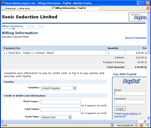
As you proceed through the transaction, you eventually leave the Onetwo site itself for a page delivered by someone else, which is where the issues really start. In Firefox when you move through to Sonic Seduction Limited's eCommerce bit, it opens in a new tab within the popup, which causes scrollbars to appear, hiding some of the information on the page. Since the pop-up cannot be re-sized, you don't get to see the whole page.
For me personally it wasn't a huge problem, as I could pretty much see what was going on. What I can't understand, though, is why you would produce a page which had just fine accessibiliy, with good information around the form entry fields, and text that could be re-sized - and then lock it into one particular size that the user is deprived of controlling? It means that anybody requiring the screen ti be displayed in large fonts wouldn't be able to see all the information on the page.
I hope, when I get it, that the album will be more accessible than the shopping experience.