Smarter searching: liberating information from the Internet - Easier visual interfaces
![]() Download a print version of this article
Download a print version of this article
This post is part of a series entitled "Smarter searching: liberating information from the Internet", based on my presentation at the 2006 AUKML Conference in Edinburgh
Easier visual interfaces
The visual interface to searching on the web hasn't change much since its inception. Either you get one big box where you can type anything into it, or you get lots of complicated boxes where you have to enter specific types of information - this is usually what you have to deal with in order to perform an advanced search.
The results interface is also pretty standardised - internet search engines tend to give you back a title, an abstract, some indication of when the document was last indexed, and an idea of a URL or a location.
To see where search might be heading though it is worth taking a peek at a new start-up search engine called Snap. It seems to have done the most in recent times to reinvent the search user interface experience. Search at Snap.com is very different to the mainstream search experience at Google, Yahoo!, MSN et al.
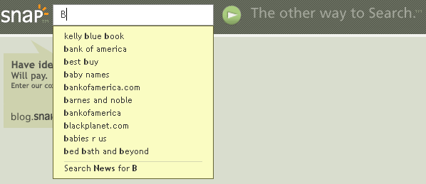
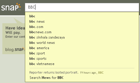
From their homepage, as you type they have integrated a suggestions type tool which prompts users to refine their queries.

News headline results are also integrated into the suggestions box when relevant to the query being built.

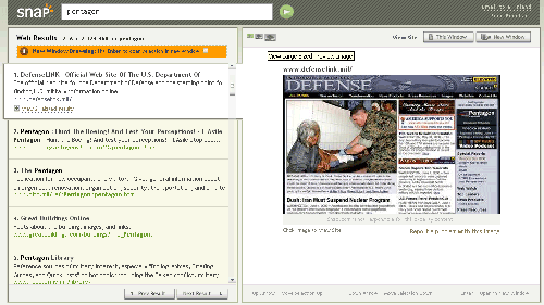
The result set includes relevant news headlines, and is then divided into two panes. The left pane lists the results, and the right pane shows a preview of the page. The user can either scroll down through the results, or use the arrow-keys to navigate down through the results. Using this keyboard navigation brings each result in turn into focus. When in focus, the right-hand pane displays a preview image of the destination site. When the preview image is selected, it is replaced by a copy of the live page.

Snap.com uses the most recent client-side web programming techniques to allow contextual help to be placed all around the interface.

Snap believe that people make more sense, more quicker, from visually-oriented results rather than text excerpts, and that there is a lot of time is spent going back and forth between result excerpts and the actual result page searching for what people want.
The user interface does takes some getting use to, and their actual results sets are not yet in the same quality league as either Google or Yahoo!, but they certainly seem to be taking the first steps in what could be a revolutionary journey for the way people present search results.
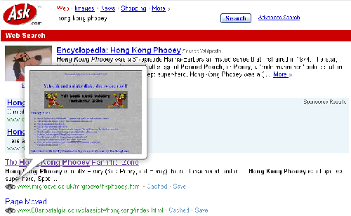
Ask.com also have a visual preview feature - in their results set there is a binoculars icon, that brings up previews of search results.

In the final part of this article, I will be looking at how users can shop around to find the best results.