Redesigned Sun Online search
Earlier this year I did a survey of site search across British newspaper online properties. Of all the papers I looked at, I found The Sun's online site search to be one of the most annoying. This wasn't just because the quality of the results were poor and the user interface spawned multiple pop-ups, it was also because I tested the site during the World Cup when they were running a special jingoistic masthead, which displaced their usual search boxes. As a result, a lot of my findings about their poor search box placement and dreadful user experience were irrelevant once the tournament ended, and they returned to their regular layout.
Luckily for me, they've now redesigned the whole online service, and the search functionality with it - so I can another crack at analysing it in the hope that this analysis will stay current for more than three weeks or so.

The Sun's new masthead features a search box placed to the right of the screen which features two options, searching The Sun, and searching the web which is powered by Ask.com. The default is to perform a site search over the paper's content. The search box is also repeated in the footer of each page.

The Sun's archive site search used to bring back a rather over-enthusiastic 100 results per page if possible. The new site's search results page brings back 25 results. Each result features a headline title, a very short description of the story, and the date of original publication, and they can be sorted by date or relevance.

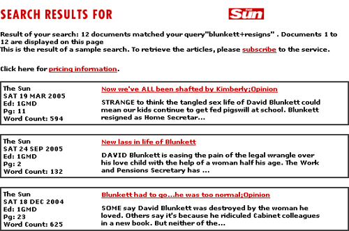
This is a lot less information than was provided in the previous iteration of The Sun's online search, which also included information on the original page number in the print edition an article appeared, alongside a larger abstract and a word count.

The new search service does highlight search terms within the results set though, using red italic type to indicate where a word in the headline or excerpt has matched one of the search terms. In my earlier survey of search facilities The Guardian was the only newspaper to have this feature in their search results.
There doesn't seem to be any kind of advanced search facility on the re-vamped site, whereas The Sun used to support quite sophisticated queries into the archive, and there doesn't seem to be any way of restricting the results to any kind of date range that the previous service offered.
The Sun still also offers a separate photo sales search. This site still irritatingly disables the right-click context menu on a PC to prevent people copying the images - as if Prnt Scrn wasn't going to work either.

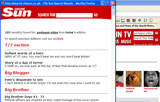
This site has also not fitted in well with the new redesign - as it still shows a scrunched up version of the old Sun Online banner and launches a pop-up window featuring the old search service.

So far it all sounds like the new search service is rather a step backwards from the options that the site used to provide. However the newly redesigned service has one major difference. The old search service acted as a window onto premium content, and once located via the search, a user had to pay to download the content they had found. The Sun appears to have abandoned the paid for archive policy, and anything found by the search engine now looks to be readable by the user for free, although I could only find content going back to 2002. This is quite a significant shift away from the paid-for-content business model that News International stuck by for so long, and in the end although it is less feature rich, I'd say it makes this iteration of The Sun's search more useful than before in terms of delivering results.