Searching The Daily Mail
I've recently been doing a survey of how well search works, or doesn't, across a number of British newspaper web sites. I've already looked at a couple of News International Titles - The Times and The Sun - and now I'm going to look at one of the Associated New Media properties - The Daily Mail
For a long time the Daily Mail's online site carried a very sparse amount of content, and had some hideously intrusive advert technologies that made it very unpleasant to render the page in browsers other than Internet Explorer. However, there has been a change of strategy at their HQ, and the Daily Mail now offers a very comprehensive online offering, with a great deal of interactivity. For example, nearly every story now carries a comments box, and the comment count is displayed prominently on the headline index pages.
Search from the Daily Mail's homepage is via a small box in the top right-hand corner. The search defaults to site search, although the Mail online also offers a business directory search.

The search engine results page is quite busy, as it features a full masthead pushed down by a banner ad, a sidescraper advert to the right of the page, and full site navigation in the left-hand column.
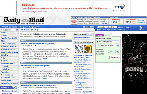
This is a shame, because the actual appearance of the results themselves were probably the best out of any of the sites I tested. Each result is delimited with a colour strip which indicates which section of the site the story originates from. This strip is colour-coded the same as the Daily Mail's online navigation is colour-coded. The results feature a larger than usual excerpt/abstract in a good font size, give clear time information, and use the link text "read" as a call to action for the user to explore further.
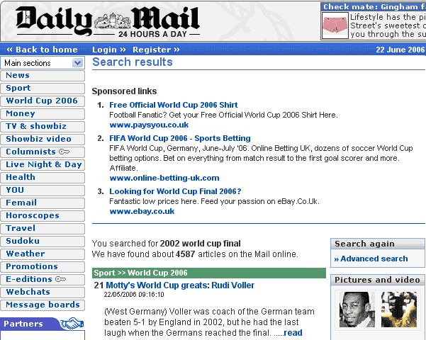
The search results page do occasionally include sponsored links - usually once the user has clicked through one or two pages of a search - here were the results I got on the third page of results for my search for "2002 World Cup Final"
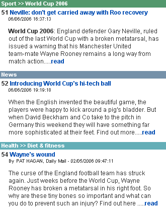
Another feature of the search engine results is a sidepod that contains links to picture galleries. These are frequently related loosely to the search, although they seem to default to a generic set of pictures in the news this week if there is no close match for the search. Clicking the links launches a pop-up window of the picture gallery concerned. This was how the pod appeared when my searches we related to football - they look more like a selection of related editorial picks than the result of processing the query "2002 world cup final"

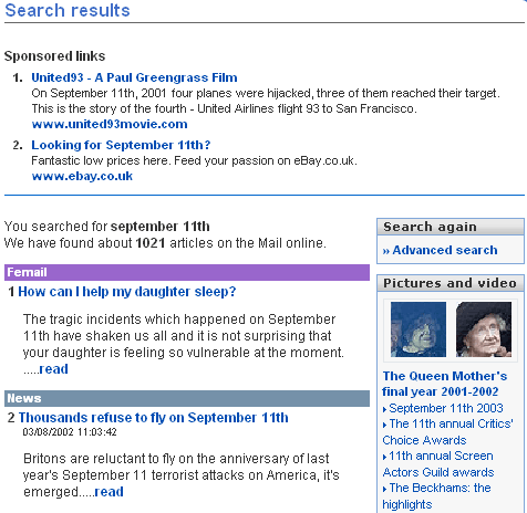
Sometimes sponsored links do appear on the first page of results, and the combination of this and the way the picture gallery links are selected can cause some editorially incongruous matches. For example, my test search "September 11th" turned up one of eBay's dynamic adverts - in this case the rather crass "Looking for September 11th? Fantastic low prices here. Feed your passion on eBay", as well as a selection of photographic galleries that include "The Beckhams - the highlights" and "The 11th annual Screen Actors Guild Awards", but no pictures of the terrorist attacks on the USA on September 11th 2001.
The Daily Mail offers an advanced search that lets you select from a generic time range like today, this week, this month, and any time. It also has drop-down boxes to fine tune the search to either a specific date, or to between a range of dates. There is the ability to narrow the search to specific main navigational sections, and to order results by date or by relevancy. One feature I didn't understand was a check-box that asked "Is this a name?". I tried searching for "Christopher Eccleston" both with the box checked and left unchecked - and got 199 results each time regardless, and both of them featured at #3 a story about Bernie Ecclestone.
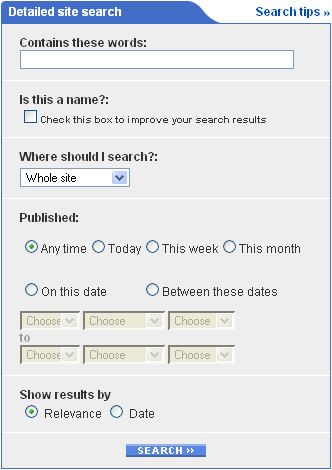
From the advanced search page the user is also invited to "Try your search on our other sites". The options available here also include searching the web using UK Plus

On the whole though I was impressed with the Daily Mail's search. Of my control searches "Blunkett resigns" turned up the right type of content plus links to special features, and the "england sweden result" search told me the game finished 2-2. I liked the navigational colour-coding in the search engine results listings, and thought the listings themselves to be amongst the most attractive currently in the market.
I felt thought that the quality of the search and the search result listings was let down by having the results page itself too cluttered. I think the Mail could still display the same level of advertising on the page, but create more space for the results to 'breathe' by dropping the left-hand navigation and full masthead. I also didn't think on the results page that there was a clear enough route to search again - the only search box was the small one in the masthead itself.
Anyway, here is a summary of the main features that I noted:
| The Daily Mail Online search - feature summary | |
|---|---|
| Results per page | 10 |
| Article excerpt or abstract | Yes |
| Date stamp (day/month/year) | Yes |
| Time stamp (hours/minutes) | Yes |
| Article word count | No |
| Navigational or Section information | Yes |
| Specifies original publication | Yes |
| Specifies original edition | No |
| Specifies original edition page number | No |
| Results display colour-coded | Yes |
| Search terms highlighted in results | No |
| Relevancy score (%) | No |
| Destination URL displayed | No |
| Sponsored links featured in results | Sometimes |
| Site offers web search | Yes - UK Plus search via advanced search page |
| Default search | Site |
| RSS feed of search results | No |
| Advanced search options | Yes - date/relevancy option, plus 'name' checkbox and section filtering |
| Search by date-range | Yes - options for today, this week, this month, and precise tuning to one day or a date range |
Tomorrow I'll continue with a look at another Associated New Media property - This Is London.