More reboot:bbc.co.uk designs - part three
I've been having a look through the late flurry of entries to the BBC's reboot:bbc.co.uk homepage redesign competition.
BBC Active Home by Paul includes a very neat tiny embedded radio player at the top of the page, although he concedes that unless it uses AJAX or iFrames or some other magic-widget-tech, it isn't going to work very well for people who immediately browse away from the homepage and lose the stream.

Buried in Paul's very long explanatory notes is this gem of an idea for the radio player:
Id customise mine to startup on radio 1 wheneve i logged onto my bbc homepage or if it had the options of a diary style system id say all weekdays go to radio1 then on saturday afternoons go to five live.
Another great idea tucked away in a design was 'Wikiscript', a collaborative user-generated script-writing wiki for a season finale of EastEnders illustrated in triplejohn's "BBC Feeds" entry

BBC rocks by Jascko not only has a great The Apprentice pastiche in the video section, but also promises a downloadable BBC toolbar for IE/Mozilla.

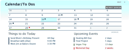
In terms of extending the functionality of the page, Addam's BBC Redesign 2.0 goes further than my idea of the BBC offering a view into your webmail inbox, with the centre-piece of the design being a personalised events calendar. Given that the DCMS were unhappy with the BBC listing public events at bbc.co.uk/whatson, I can't see this one getting state approval.

I'll be looking at a final selection of designs tomorrow.
Yeah it looks like the site was down for a while today alright.. Entrys that have stood out for me would be http://open.bbc.co.uk/reboot/gallery/2006/05/bbc_cool_blues.html and http://open.bbc.co.uk/reboot/gallery/2006/05/bbcv2006.html for technical merit these two stand out, although I think those might be team efforts as they pointed out. On a visual side of things http://jascko.topcities.com/bbc/index.html and http://open.bbc.co.uk/reboot/gallery/2006/05/my_bbc_dashboard.html stood out for me, as they seemed to not follow the trend and create something potentially exciting feature wise, whilst being very easy on the eye. There was some talent on display - however a winning entry for me would combine elements of the four entries above.What do you think?
Oh Shaun, you didn't rate my effort?
http://www.currybet.net/images/reboot/reboot.jpg
As a product manager rather than a designer the two things that stood out for me were the ambient weather display on Paul Michael Smith's Web Service BBC Homepage
http://open.bbc.co.uk/reboot/gallery/2006/05/web_service_bbc_homepage.html
And I liked redpunk's BBC Box concept - bookmarking pages and searches from the BBC site to make your own folders of "stuff"
http://open.bbc.co.uk/reboot/gallery/2006/05/home_and_bbc_box.html
I think the four you've picked out all show promising ideas - but still look to me on the whole too complicated for a BBC homepage audience.
Mind you, I can talk, my "design" tried to integrate email into it...
Maybe so but at least these entries thought about it a little and tried to create something different visually/technically for a 'savy' audience. Isn't that what creating a web 2.0 enhanced app is about.Let the existing site cater for the joe bloggs news scavengers.The BBC did ask them to push the boat out a little Martin rem - "If you build it they will come" :-)