More reboot:bbc.co.uk designs - part two
I've been having a look through the late flurry of entries to the BBC's reboot:bbc.co.uk homepage redesign competition.
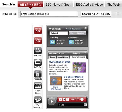
I thought BBCv2006 by Eego was a very strong entry. I liked they way they had already incorporated the new design of BBC search into their homepage design - making all of the tab/buttons available from the homepage, including the audio/video search. The gallery of 'widgets' included on the page was also impressive. They also made the following interesting suggestion in their entry 'blurb':
A few features which we didn't have time to demonstrate include:
- Configure various sub-domains of bcc.co.uk such as entertainment.bbc.co.uk, sport.bbc.co.uk, tv.bbc.co.uk etc which would all display the same page but have entertainment, sport, tv information displayed prominently in place of the top news story in our design.

Frankie Roberto has played around with the BBC's global navigational toolbar as part of his BBC:Refresh design. He has tried to address the problem of having two search boxes on the page by placing the search box near to the regular slot, and using a graphic cut into the toolbar to bring the two closer together.

This doesn't quite work for me, but the other customisation he has made of the toolbar sees the "Where I Live" link, which always performs poorly in user testing when people are asked if they understand what it means, replaced. Instead of a generic link through to a hub page, personalisation renders it as "London" on Frankie's mock-up, and presumably elsewhere the region of the users choice. I'm not sure that "Hereford and Worcester" will fit in the space so easily mind you! Additionally the TV and Radio links have been given the more call-to-action labels of 'Watch' and 'Listen'
In terms of interesting interactions, I really liked this slider from "BBC Malkovich" by FF Ecosystem.

In their blurb they describe at as a mechanism to ensure that the design doesn't lose "the BBC's ability to show you things you didn't know about". That is, of course, one of the greatest risks of increasing personalisation of content, that unless you are able to build in features that facilitate serendipitous discovery, you have locked a user into a set of content that doesn't introduce them to new things.
I'll be looking at a final selection of designs tomorrow.