More reboot:bbc.co.uk entries
I've already devoted a couple of posts to looking at some of the entries to the BBC's reboot:bbc.co.uk contest, and wanted to write about some of the highlights of the late flurry of entries that were published just before the competition closed. This wasn't helped by the website itself needing a reboot after it was unavailable last week all over the UK's bank holiday weekend - but I've had a look through them all now.
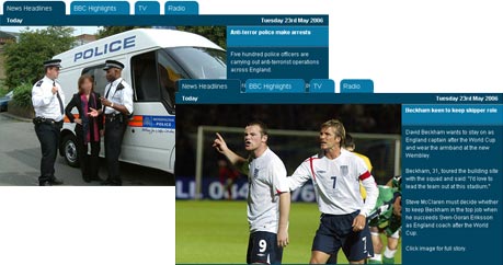
Of course, a design competition should be all about the ideas, the innovation and the interactions, but you can't help falling for a cute visual experience or a well worked prototype. BBC (re)Booted by dEZ has both. The prototype flash newsreader has large images that give it a glossy magazine feel, and from an interaction point of view it packs a lot of content punch into a small space.

Similarly, I also liked the big picture splash treatment of the news on BBC Hub by TK, although as eyedropper will testify, this kind of approach is entirely reliant on there being good enough pictures in the right quality in the right aspect ratio. To be able to pull it off for really dull stories like 'PM says something uninteresting about pensions in Houses of Parliament' would be quite a feat.

Evolution not Revolution with Web 2.0 by Graphics Dude was also a nice working prototype, with content panels that could be dragged around.
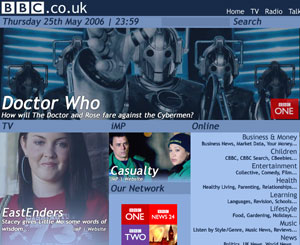
If images, though, are going to dominate the page, then picture treatment is key to the visual success of the design. The steely blue tint applied to the images of Cybermen and an EastEnders actress (spot the difference anyone?) work fine in Blocky by Daniel, but tinting a promo for the Chelsea Flower show in anything other than green or rose pink isn't going to work.

Mind you, Daniel does additionally make a salient point about people who have designed their reboot:bbc.co.uk entry almost entirely around the BBC's news output:
If you want news, set /news as your homepage.
I'll be looking at another selection of designs tomorrow.
Thing is Martin- BBC (re)Booted by dEZ is taking credit for todd domineys work as it was he that created the flash slideshow - its a commercial product! A little bit sneaky dont ya think. Incidently is it just me or did very few manage to create something truly innovative and worthy of the title web 2.0 for the reboot contest? What do you think, only a handful have actually done something viable and different..most are just redesigns of the beebs existing content, offering v.little new ways of getting at the content itself.Why not review a few of the more innovative entrys?
That is a bit cheeky - but after all, "Talent borrows. Genius steals", or something. It just goes to show how a nice bit of visual trickery dulls the critical facilities a little.
>> Incidently is it just me or did very few manage to create something truly innovative and worthy of the title web 2.0 for the reboot contest?
Yeah, I think if I was still at the BBC I would have been a little let down with the quality of the entries. Some of the designs were nice, but a lot of it was just pushing pixels around
>> most are just redesigns of the beebs existing content, offering v.little new ways of getting at the content itself.
I think one thing that the BBC may have learned from the exercise, which is valuable in itself, is that people have got pretty fixed ideas of what should be on that page - news / sport / weather and some links.
>> Why not review a few of the more innovative entrys?
Which did you think were the most innovative? I've just cherry-picked a few of the entries that had elements that caught my eye.
And, is it just me in Greece, or has the whole reboot site vanished?
>> And, is it just me in Greece, or has the whole reboot site vanished?
It must have just been me