Reboot:bbc.co.uk - the designs so far - part two
I've been looking through some of the designs in the gallery of the BBC's reboot:bbc.co.uk homepage competition, where I have been contributing to the blog.
I wasn't sure about the intended use of frames in h2g2bob by David Batley, but I liked the pictoral icons helping people to understand the classification.

I was intrigued by the "freak penguin accident" in the news on that page, but I wondered how 2 people could get injured in a regular penguin accident? Perhaps that is something that could be investigated by the citizen journalism panel in BBC Fluid by Daz?
The Citizen Journalism component we see as being a search, collection and presentation tool for world news from many of the journalism sources of the future; blogs, RSS news feeds,podcast & videoblogs. These can be searched for and subscribed to directly from this component.
If time and money were possible I would create a predictive/historical journalism component that fed news into this component based on previous searches and overall searches on the web.
I would also allow modules to be created via an open source kit by all the major leading web tools like; ebay, amazon, wikipedia, blogger, gmail, hotmail - allowing modules to be added to the pages by the consumer who could then use the page as their platform to the entire web.

It was interesting to see which elements of the page people take as "given" - and an awful lot of the entires retained the ability to switch between a domestic and international edition of the page - which was something only introduced last December. It looks like the concept of an international bbc.co.uk homepage did turn out to be quite simple to grasp after all, despite all of the confusion over the relative roles of bbc.com and bbcnews.com as domains.
One entry even went further - Nick Toye's BBC Passport plans to track you around the globe via GeoIP location, and serve you up a local flavour of content accordingly.
Another element that quite a few people retained was the popular links panel that I helped develop for the 2002 BBC Homepage design. BBC by GHS reformatted it though as a tag cloud.
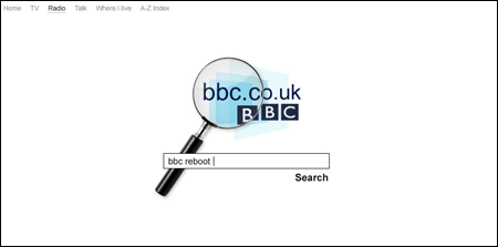
With the designs that tended towards the minimal I liked this unsubmitted piece of concept work by AMKDesign.

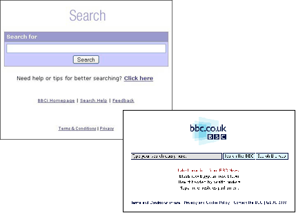
It is an approach I looked at when developing my theoretical entry for the contest, and very similar to the old BBC Search homepage.

There were a couple I enjoyed just because they were so shamelessly retro. Matt Sephton submitted See Facts - essentially the front page of Ceefax slapped under a BBC.co.uk logo. Jeroen van Geel's entry featured a drop-down menu where you selected your radio station according to FM frequency, which reminded me of when the BBC changed all of its radio frequencies during the seventies and you had to stick little stickers on your radio dial.
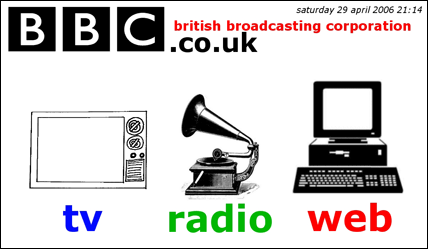
Meanwhile, Chris Hammond's streamlined portal entry decided to fly in the face of the fact that it is all played off hard drive these days by representing BBC radio with an old-style gramophone player.

I also smiled at Aegir Hallmundur's "Get It Back" design - a simple page with a button where you reclaim your Licence Fee. It always still amazes me though that when in an attempt to be open, to spark debate, and frankly just to not censor competetion entries, the BBC publishes something like this, it generates comments like:
"Ha ha. I like it. :-) How did they allow this one to be published?"
"Haha! Do the BBC even look at these?"
Overall though, as James pointed out in his comment on my previous entry about reboot:
the main thing I notice is that most of them are purely a redesign of the current page, with no additional Web 2.0 integration.
I agree. I'm not sure that anything anyone has proposed so far has been the radical rip-up of the page that the BBC was perhaps hoping for - most people seem pretty set in their perceptions that the BBC homepage should be news, sport, weather plus what is on the telly.