Looking at the new BBC search - part three
I've been taking a look at the new version of BBC Search which was launched earlier this month.
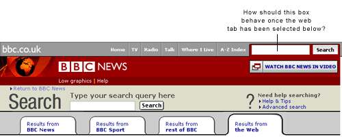
One thing that the design has done is to focus the search interaction even more tightly onto the one search box by removing the global search box from the toolbar at the top of the page. It looks slightly odd to me, but then I've spent nearly five years staring at the toolbar on the top of the pages of bbc.co.uk, so maybe I'm an extreme case.

It does solve one problem with the previous design - which was defining how that search box should behave once a user had selected one of the tabs above the results set below. For example, if you had selected from BBC News a tab to narrow the search to 'results from the web', how should the search in the toolbar behave - should it retain the default behaviour of searching "BBC News", or should it follow the tab selection and now perform a web search?

Of course, it wouldn't be the BBC if solving one problem didn't create two more.
The search box has also been removed from all of the support pages around search, and this doesn't make much sense to me. It has been replaced by a very large well sign-posted box at the foot of each section of content, but the point of having the search box in the top right-hand corner of every page is to provide a global experience. It seems odd that at the very point where the user is asking for help and information about search, they are offered a search box in precisely the opposite place they will find it situated on any other set of pages in the site.

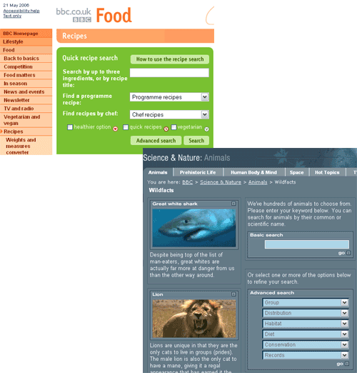
The second question it poses is then about other pages of the site. What about the BBC.co.uk homepage. If 'search' pages don't need a search box in the top right-hand corner because they already have one set into the page, then why does the homepage still have one? And what about the Recipe Finder page, with its bespoke search? Or likewise, the Wildfacts database?

I was always very suspicious of things that claim to be so unique that they have to opt-out of some element of the BBC's global navigation - as there are only a certain number of opt-outs you can tolerate until you no longer have global navigation. In fact I feel that the BBC is rapidly approaching that point - given that there are now global toolbars with and without tabs for domestic and international users, toolbars containing different content for different age groups, and now there appears to be an opt-out of having a search box.
On Monday I'll conclude by looking at the appearance of the search engine results themselves, and the BBC's web search service.
Interesting blog post. I hadn't noticed that the global search box disappeared on the search pages.
For my BBC homepage redesign competition entry - http://www.frankieroberto.com/bbcrefresh/design - I positioned a wider search box just underneath where the global search box normally is, and 'tabbed down' the tab that's usually there.
This, I hoped, would prevent the problem of having two search boxes on the homepage, and would draw people's attention to the global search functionality.