Looking at the new BBC search - part four
I've been taking a look at the new version of BBC Search which was launched earlier this month.
In the news story accompanying the redesign my friend and ex-colleague Daniel Mermelstein is quoted as saying "People expect a certain way of displaying the results and for data to follow that convention. It's a much more standard search interface".
The visual appearance of the results is certainly simpler and more conventional than it used to be. I do have some reservations though.
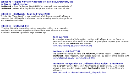
The BBC site is cursed with over-enthusiastic branding or substitute crumbtrail navigation in its <TITLE> tags. This always led to BBC search pages that were completely over-burdened with pages with titles like "BBC - BBC something - BBC something else section - whatever it is the page is about". The new results interface strips out the first example of this excessive use of the term BBC, so that pages appear more localised
I think that is a smart move, and beneficial to users of BBC search. However, one of the downsides of this is that whilst it may fix this problem for BBC.co.uk users, it gives no incentive to content producers to fix how BBC content appears to the rest of the world via Google, Yahoo!, MSN et al.
As well as stripping out this multiple BBC branding, the results page also performs the double-whammy of hiding the URL. I think this is really unhelpful to the user, who on many search results now have a lot less idea of which area of the BBC site they are being taken to. I find myself mousing over the title to get a glimpse of the destination URL in the status bar of my browser.
It also flies in the face of search engine convention, and makes it look slightly odd that the web search scope does include the URL.

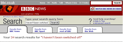
Talking of the web search, this redesign has further marginalised the BBC's service. BBCi Search used to be the focal point of the BBC homepage, but is now just one scope amongst four. The scope selection buttons are spaced according to their names, so web search is now the last and smallest button.
The rationale behind having web search was always a way of the BBC fulfilling its role to be a trusted guide to the web for the UK, and a way of making the BBC a starting place to look for information for any query, even if the BBC couldn't help you itself. Editorially selected best links, however, are still returned in a side-panel when doing a BBC search.
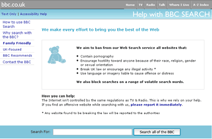
I do wonder if the BBC is at heart still fully committed to providing a web search service - even the pages explaining the BBC's policies on UK focus, web safety and the BBC's web recommendations contain one big search box pointing just to the BBC's own site search

On the whole I think the redesign is a positive step in the right direction from the BBC. It was evident for some time within the BBC that the approach of splitting the content into multiple silos didn't work for a lot of users who didn't understand how to manipulate the various options the search service provided. Although I have my reservations about some aspects of the redesign, I think the overall feel of the page is less cluttered and at the same time more informative. The integration of A/V results into mainstream search is a valuable step towards the BBC fully exploiting the multimedia assets it has available online, and the interaction design of the page looks to have simplified some of the problems with the previous design.
I'd expect to see some iterative improvements to both the design and the content indexing over the coming months, and hopefully it won't be four full years again before the BBC invests money in improving one of the key navigational channels on BBC.co.uk.
P.S. If you want to make a quick comparison with the old design in action - then the Firefox BBC News plug-in still points to the old BBC News search servers, which haven't been unplugged yet.
