The travellers' internet: Designing applications for those on the move - part two
Over recent months I have been travelling through Europe and the Middle East, which has meant me using all kinds of web applications from internet access points that were not my usual domestic internet connection. Yesterday I outlined some of the issues I encountered with browser compatibility, JavaScript and cookies. Today I want to look at issues I had with one of the web's most talked about photo-sharing applications, Flickr.
Internet session during travelling tend to have a very tight task-orientated focus, and this can highlight shortcomings in web and software applications that may not be readily apparent during home use. Flickr has often been held up as one of the shining lights of the Web 2.0 generation of internet protocol based applications, but for the first time it fell short in providing me with the ability to perform what I wanted to do, and delivering the high quality of user experience it is generally associated with.
For some time I have used the Flickr Uploadr piece of software for Windows to get my pictures onto the system. It has a simple drag'n'drop interface allowing you to upload multiple pictures from your local machine.
Whilst I was travelling, this worked fine if I could connect my own laptop to the internet, or when I was using the internet somewhere with machines that were not locked-down and I could install the application onto the machine. However, if I only had access via a machine other than mine where I did not have the permissions to install software (i.e. most of them) the only route to uploading my pictures was via the Flickr site itself.

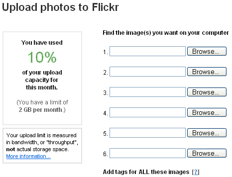
The upload form only processes six pictures at a time. To upload a significant number of pictures (which we were naturally generating because we were travelling) meant going through several iterations of: browsing for a photo, selecting it, repeating that five more times, uploading the photos, waiting for them to be processed and re-sized, and then adding titles, description and tags. Then repeating the whole process.
I needed either to be able to customise the upload form to accept more files in any one batch, or needed an online equivalent of the Flickr Uploadr that allowed me just to point to a directory local to the machine I am using and say "Upload that".
In fact, because the upload process was so slow, I changed the naming convention of my photographic files to descriptive human readable names, in order to skip the editing of the titles, but still convey to people what the photos were actually of before I had the time to later title and tag them properly on Flickr.
Logging in to web applications is a chore at the best of times, and one that is even more unpleasant whilst travelling. Firstly none of your cookies are present. Secondly none of your autocomplete data is present for login forms. Thirdly most modern browsers will prompt you to save the username/password combination if the feature is enabled, often in a different alphabet let alone language where I have been travelling, adding an extra step and click into the process.
A couple of applications that I use frequently had particularly awkward login process, which illustrate a couple of more general points.
Flickr is a culprit again in this regard. Arriving at flickr.com on a non-cookied browser session and following the link to sign in leads you to a fork in the decision path - do you need to sign in with your Yahoo! ID or your Flickr password. I understand the issues with merging two membership databases into one interface, but it has now been over a year since Flickr was purchased by Yahoo! There is a golden rule about not showing your system architecture's underwear in public. Making the user choose between the two login options adds an extra step into the journey.

Straplining logging into a non-Yahoo! or non-merged-with-Yahoo! Flickr account as "You must be old skool. Rock On" doesn't stop it not rocking to be made to think about it. Even less helpfully the page adds a condescending "You might want to bookmark this" link to a page to avoid the interstitial in the future, neatly sidestepping the fact that if I had access to my bookmarks, I'd no doubt also have access to my Flickr.com cookie and wouldn't be at this page at all.
Between them Flickr and Yahoo! ought to have gained enough data about the proportion of Yahoo! members using Flickr and the proportion of Flickr users with "old skool" accounts using the service to work out in which order the login API calls should be made, but surely by now the fork in the login path should be done seamlessly in the back-end.