Taking a look at FeedLounge
I've been using Bloglines as my web-based RSS aggregator of choice for some time, and found the only shortcoming of it to be that I couldn't integrate internal feeds from behind the firewall where I used to work, which was hardly the fault of Bloglines itself. However, coming back to working with an aggregator on a day-to-day basis after having been travelling for four months I got a little bit of wanderlust and wondered what else was out there. To that end I have been trying out some of the alternatives.
Back when it was first announced I was intrigued by the promise of FeedLounge, as a very slickly interfaced web-based RSS reader, and so when I got an email saying it was now available to the public I was very interested to try it. Currently it is available on a paid basis for a nominal $5 per month, and also available as a free trial demo. I took the free trial demo to see how the application lives up to the claims it makes.
The FeedLounge demo is time-limited. It is available for a 24 hour period, and only takes 500 trial users in each session. As they explain on the site:
Running a web-based feed reader is very resource intensive. As an "Alex and Scott"-funded operation, FeedLounge doesn't (yet) have the resources to run two full production systems. We don't want to degrade the FeedLounge experience for our customers by allowing thousands of trials in our production system, so we've opted to set up the free tour on a separate, but less powerful system.
Since we are running the tour on less powerful hardware, we must limit the number of users that can be on the free tour. If we didn't limit the number of users in the free tour, performance would suffer - and performance is an important part of the user experience.
The first thing to note about the demo is that it isn't 24 hours from the moment you sign up, it runs in a twenty-four hour cycle which flips over and chucks everyone out at midnight PST. Which means that in Greece just after 10am is the best time to sign up, in London just after 8am, which gives you the whole twenty-four hour period to play with it.
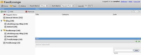
Once registered for the demo you are taking straight into the interface, which comes pre-populated with several feeds about FeedLounge itself. That works well in terms of giving an immediate overview of how things will look once you've added some feeds of your own. My immediate impression was very positive.

It was on returning to the service that I encountered some difficulties. The login to the demo isn't terribly intuitive. Rather than entering your username and password from the homepage at www.feedlounge.com you have to follow the link to sign up for the tour again before you can enter the trial version. Having said that, the interface had a very quick and cute Web 2.0 way of signifying that I had gone wrong without a page reload.

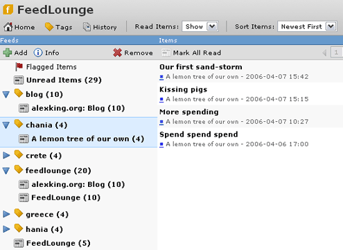
FeedLounge offers three views of your feeds. There is the classic email application view, with two columns, the right-hand one of which is divided into two panes. There is a three column layout, where in the left you see your list of feeds, in the centre the titles for a selected feed or tagged group of feeds, and in the right column you see individual entries. Finally there is the "river of news" view, which looks like the Bloglines default view, with your list of feeds on the left, and a scrollable column of full entries one after the other on the right. Of these options, the 3 column view seemed to me to be the preferable one, although I wondered how well it would cope with feeds that had large-sized pictures embedded into the RSS.

I did find, though, that having the permalink to an individual entry signified with a '#' in the middle column wasn't terribly immediate. Given the current tech-leaning profile of the majority of RSS reader users I didn't see this is a huge issue, but I do believe that it is assumptions like this - that an audience will understand # as a href - which inhibit the potential take-up of RSS feed reading amongst the wider internet population. I was pleased though to see that as a default, opening sites spawned a new window (which could be modified to a new tab if you were using a browser with that ability).
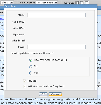
Autodiscovery of feeds worked well - simply entering the URL of the site you wanted to subscribe to caused FeedLounge to scurry off and fetch the feed. I did encounter some bugs though. For example when clicking on the 'Info' icon I found that the pop-up that appeared wouldn't go away with pressing either OK or Cancel. In the end I had to browse away from FeedLounge and start a new session to continue my demo. Similarly, playing around with the preferences also brought up a dialogue box that subsequently couldn't be closed.
