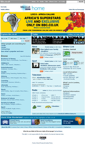
Audience Reaction to the BBC Homepage Live8 Special
It seems incredible with all that has happened this week that last Friday I was writing about the special Live8 homepage that the BBC had just launched, to promote the streaming coverage of the concert at the Eden project, and to provide the latest news updates from the events all around the globe.
At the time we promised to publish a summary of the audience reaction on the Points of View message board, as once again we had coupled changing the homepage design with a call to action asking people what the thought of the new look.
When we did that for the special Doctor Who homepage we were swamped with nearly 1,500 emails. The Live8 page only generated around 50 emails.
I was sort of disappointed that the page hadn't made as much impact with our users. However, we had taken into account comments made about the Doctor Who page and adjusted the design accordingly - so I think reducing the number of people who complained from over 500 to under 20 showed this was a move in the right direction. It still showcased an event we wanted to highlight, but it didn't disrupt so many people using the site.
You can find the Points of View thread detailing some of the responses at - http://www.bbc.co.uk/dna/mbpointsofview/F2131439?thread=681447
Personally my favourite quotes from the emails - which sum up the problem we seem to face any time we make any significant changes to bbc.co.uk - were two passionate pleas, one in favour of change, and one dead set against.
You made a change to the home page a few weeks ago with new colours and much larger picture for lead story. I thought it was great and told you so but it went back to the boring old blues we still have. Change is good.
where's my old BBC home page......why does this feverish need for change penetrate every damned area of everything....did anyone actually ask for change - or did someone decide we needed it?
