Gaining Online Advantage: Global navigation - part 5
This is page 5 of a 13 page article - 1 2 3 4 5 6 7 8 9 10 11 12 13
![]() Download a print version of this article
Download a print version of this article
Global navigation
In part one of this article I looked at how in order to have a successful web presence you needed to identify both your business needs on the web, and the needs of your customers and audience. I also discussed how identifying your business model, and provding unified branding were important, using the BBC as a case study.
I want to look now at how that BBC branding is done in the UK specifically. This is something that I think is very important for large or federated organisations like a government department where there is a lot of different content types to navigate across. I used to work in the BBC's central New Media department, which builds a lot of the 'glue' that brings the BBC site together.
Global navigation is used to pull the site together as one whole. Every page on bbc.co.uk has the same grey toolbar across the page. It doesn't necessarily have the same links, for example the international sites concentrate on news, sport and weather. Likewise the children's toolbar concentrates on educational content - teachers don't want kids easily wandering off into the EastEnders site when they should be learning.

By doing this the BBC is able to lock all of the web pages into a template, give them a consistent look and style, and provide consistent global navigation.
There is also have a standard left-hand navigation on most pages on bbc.co.uk. Some portal pages like the front pages for genre areas like lifestyle, or regional areas like the Wales homepage, or the homepage itself, don't carry this navigation, and go for a more widescreen format. However on the majority of content pages the BBC has a standard layout in the top left-hand corner which provides links back to the homepage, and importantly a 'Text only' link which will re-render the page via the BETSIE parser making it more accessible. One of the reasons for placing this link high up in the page is to ensure it easily found in the same place by anyone with access issues, however they enter the BBC site.
The left-hand navigation isn't there just to impose a look and feel on pages, but it is there to ensure that every page meets the BBC's navigational and accessibility standards and guidelines, which are agreed and ratified across the whole of the business.

The local navigation sits underneath the top panel, and can be made as either a standard text navigation, or can be done graphically, providing it sits within the size constraints of the width allowed.
The template then provides some consistent navigation in the footer of the page, including a link through to "About the BBC" which leads to the BBC's corporate information site. In this area there is also a 'Contact Us' link. Every single content area on bbc.co.uk has its own custom feedback page. The users of that area get a response page tailored towards their likely questions, and the BBC is able to filter the mail it receives via the feedback forms to send them to the right destination within the organisation. Whilst this is an advantage for the user, since every single page on the site allows them to contact the BBC, it is also a risk for the BBC in terms of managing incoming email, and is one of the reasons why the BBC has in excess of two million audience contacts by email per week.
There is also a 'Help' link on every page. So again not only is the corporate look and style reinforced, but assistance is provided to the audience on every page.
These kind of architectural glue elements make the site hang together as a coherent whole, even though the content is produced by a very large and diverse organisation. There are, for example, production units making the site in Northern Ireland, in Scotland, in Wales, and World Service correspondents are filing content from around the globe. Enforcing this global template gives the site a familiarity and simplicity for the audience regardless of how and where the content has been created.
Search
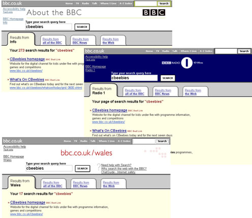
The next element of glue is the search service. You'll notice that the toolbar has a search box in the top-right hand corner. This means that on every page on the BBC website you can get to search straight away. If you've navigated to a dead end, or you've got yourself lost, or you simply want to start over looking for a different type of content, you can go directly to search from every page.

The other thing I should mention with the search service is that the content is pulled together from all over the site. News and Sport content is separated out for two reasons, one technological and one editorial. News is different. When you are executing a search on the BBC News site relevancy isn't always the most important issue, timeliness is. The aim is to index every story on the BBC News site into the search service within 15 minutes - an indexing target that doesn't need to meet for content that isn't time sensitive, like recipes, or games and quizzes.
Every other piece of content on the site is pulled into one index, and again I would stress that if you have a large and diverse organisation, with a complex website, you will need to work on ensuring that you have a very good search mechanism.
Continue to find out about the role classification and indexing can play in unifying a large site and building a successful web presence.